Detecting fraudulent transactions is a key applucation of statistical modeling, especially in an age of online transactions. R of course has many functions and packages suited to this purpose, including binary classification techniques such as logistic regression. If you'd like to implement a fraud-detection application, the Cortana Analytics gallery features an Online Fraud Detection Template. This is a step-by step guide to building a web-service which will score transactions by likelihood of fraud, created in five steps: Generate tagged data Data Preprocessing Feature engineering Train and Evaluation Model Publish as web service Each step makes use of the R language,...
from R-bloggers http://ift.tt/1OLb3TQ
via IFTTT
domingo, 27 de diciembre de 2015
R sucks
I’m doing an analysis and one of the objects I’m working on is a multidimensional array called “attitude.” I took a quick look: > dim(attitude) [1] 30 7 Huh? It’s not supposed to be 30 x 7. Whassup? I search through my scripts for a “attitude” but all I find is the three-dimensional array. Where […]
The post R sucks appeared first on Statistical Modeling, Causal Inference, and Social Science.
from R-bloggers http://ift.tt/1RHWN4w
via IFTTT
Basic Concepts in Machine Learning
What are the basic concepts in machine learning? I found that the best way to discover and get a handle on the basic concepts in machine learning is to review the introduction chapters to machine learning textbooks and to watch the videos from the first model in online courses. Pedro Domingos is a lecturer and professor on machine learning […]
The post Basic Concepts in Machine Learning appeared first on Machine Learning Mastery.
from Machine Learning Mastery http://ift.tt/1QYY6dQ
via IFTTT
How to create a Twitter Sentiment Analysis using R and Shiny
Everytime you release a product or service you want to receive feedback from users so you know what they like and what they don’t. Sentiment Analysis can help you. I will show you how to create a simple application in R and Shiny to perform Twitter Sentiment Analysis in real-time. I use RStudio. We will […]
from R-bloggers http://ift.tt/1OsEWhH
via IFTTT
from R-bloggers http://ift.tt/1OsEWhH
via IFTTT
martes, 22 de diciembre de 2015
Useful Things To Know About Machine Learning
Do you want some tips and tricks that are useful in developing successful machine learning applications? This is the subject of a journal article from 2012 titled “A Few Useful Things to Know about Machine Learning” (PDF) by University of Washing professor Pedro Domingos. It’s an in interesting read with a great opening hook: developing successful machine […]
The post Useful Things To Know About Machine Learning appeared first on Machine Learning Mastery.
from Machine Learning Mastery http://ift.tt/1Jsb5OQ
via IFTTT
viernes, 18 de diciembre de 2015
Anomaly Detection in R
Introduction
Inspired by this Netflix post, I decided to write a post based on this topic using R.
There are several nice packages to achieve this goal, the one we´re going to review is AnomalyDetection.
Download full -and tiny- R code of this post here.
Normal Vs. Abnormal
The definition for abnormal, or outlier, is an element which does not follow the behaviour of the majority.
Data has noise, same example as a radio which doesn't have good signal, and you end up listening to some background noise.
- The orange section could be noise in data, since it oscillates around a value without showing a defined pattern, in other words: White noise
- Are the red circles noise or they are peaks from an undercover pattern?
A good algorithm can detect abnormal points considering the inner noise and leaving it behind. The
AnomalyDetectionTsinAnomalyDetectionpackage can perform this task quite well.
Hands on anomaly detection!
In this example, data comes from the well known wikipedia, which offers an API to download from R the daily page views given any {term + language}.
In this case, we've got page views from term fifa, language en, from 2013-02-22 up to today.
After applying the algorithm, we can plot the original time series plus the abnormal points in which the page views were over the expected value.
About the algorithm
Parameters in algorithm are max_anoms=0.01 (to have a maximum of 0.01% outliers points in final result), and direction="pos" to detect anomalies over (not below) the expected value.
As a result, 8 anomalies dates were detected. Additionally, the algorithm returns what it would have been the expected value, and an extra calculation is performed to get this value in terms of percentage perc_diff.
If you want to know more about the maths behind it, google: Generalized ESD and time series decomposition
Something went wrong: Something strange since 1st expected value is the same value as the series has (34028 page views). As a matter of fact perc_diff is 0 while it should be a really low number. However the anomaly is well detected and apparently next ones too. If you know why, you can email and share the knowledge :)
Discovering anomalies
Last plot shows a line indicating linear trend over an specific period -clearly decreasing-, and two black circles. It's interesting to note that these black points were not detected by the algorithm because they are part of a decreasing tendency (noise perhaps?).
A really nice shot by this algorithm since the focus on detections are on the changes of general patterns. Just take a look at the last detected point in that period, it was a peak that didn't follow the decreasing pattern (occurred on 2014-07-12).
Checking with the news
These anomalies with the term fifa are correlated with the news, the first group of anomalies is related with the FIFA World Cup (around Jun/Jul 2014), and the second group centered on May 2015 is related with FIFA scandal.
In the LA Times it can be found a timeline about the scandal, and two important dates -May 27th and 28th-, which are two dates founded by the algorithm.
Our Twitter and LinkedIn Group
More posts here.
Thanks for reading :)
from R-bloggers http://ift.tt/1NsHPvm
via IFTTT
jueves, 17 de diciembre de 2015
Using Decision Trees to Predict Infant Birth Weights
In this article, I will show you how to use decision trees to predict whether the birth weights of infants will be low or not. We will use the birthwt data from the MASS library. What is a decision tree? A decision tree is an algorithm that builds a flowchart like graph to illustrate the […]
from R-bloggers http://ift.tt/1O9HQrl
via IFTTT
from R-bloggers http://ift.tt/1O9HQrl
via IFTTT
martes, 15 de diciembre de 2015
R and Python: Theory of Linear Least Squares
In my previous article, we talked about implementations of linear regression models in R, Python and SAS. On the theoretical sides, however, I briefly mentioned the estimation procedure for the parameter $boldsymbol{beta}$. So to help us understand how software does the estimation procedure, we'll look at the mathematics behind it. We will also perform the estimation manually in R and in Python, that means we're not gonna use any special packages, this will help us appreciate the theory.
R ScriptPython ScriptHere we have two predictors
Now let's estimate the parameter $boldsymbol{beta}$ which by default we set to $beta_1=3.5$ and $beta_2=2.8$. We will use Equation (ref{eq:betahat}) for estimation. So that we have
R ScriptPython ScriptThat's a good estimate, and again just a reminder, the estimate in R and in Python are different because we have different random samples, the important thing is that both are iid. To proceed, we'll do prediction using Equations (ref{eq:pred}) and (ref{eq:yhbh}). That is,
R ScriptPython ScriptThe first column above is the data
You have to rotate the plot by the way to see the plane, I still can't figure out how to change it in Plotly. Anyway, at this point we can proceed computing for other statistics like the variance of the error, and so on. But I will leave it for you to explore. Our aim here is just to give us an understanding on what is happening inside the internals of our software when we try to estimate the parameters of the linear regression models.
from R-bloggers http://ift.tt/1UtQfVV
via IFTTT
Linear Least Squares
Consider the linear regression model, [ y_i=f_i(mathbf{x}|boldsymbol{beta})+varepsilon_i,quadmathbf{x}_i=left[ begin{array}{cccc} 1&x_{11}&cdots&x_{1p} end{array}right],quadboldsymbol{beta}=left[begin{array}{c}beta_0\beta_1\vdots\beta_pend{array}right], ] where $y_i$ is the response or the dependent variable at the $i$th case, $i=1,cdots, N$. The $f_i(mathbf{x}|boldsymbol{beta})$ is the deterministic part of the model that depends on both the parameters $boldsymbol{beta}inmathbb{R}^{p+1}$ and the predictor variable $mathbf{x}_i$, which in matrix form, say $mathbf{X}$, is represented as follows [ mathbf{X}=left[ begin{array}{cccccc} 1&x_{11}&cdots&x_{1p}\ 1&x_{21}&cdots&x_{2p}\ vdots&vdots&ddots&vdots\ 1&x_{N1}&cdots&x_{Np}\ end{array} right]. ] $varepsilon_i$ is the error term at the $i$th case which we assumed to be Gaussian distributed with mean 0 and variance $sigma^2$. So that [ mathbb{E}y_i=f_i(mathbf{x}|boldsymbol{beta}), ] i.e. $f_i(mathbf{x}|boldsymbol{beta})$ is the expectation function. The uncertainty around the response variable is also modelled by Gaussian distribution. Specifically, if $Y=f(mathbf{x}|boldsymbol{beta})+varepsilon$ and $yin Y$ such that $y>0$, then begin{align*} mathbb{P}[Yleq y]&=mathbb{P}[f(x|beta)+varepsilonleq y]\ &=mathbb{P}[varepsilonleq y-f(mathbf{x}|boldsymbol{beta})]=mathbb{P}left[frac{varepsilon}{sigma}leq frac{y-f(mathbf{x}|boldsymbol{beta})}{sigma}right]\ &=Phileft[frac{y-f(mathbf{x}|boldsymbol{beta})}{sigma}right], end{align*} where $Phi$ denotes the Gaussian distribution with density denoted by $phi$ below. Hence $Ysimmathcal{N}(f(mathbf{x}|boldsymbol{beta}),sigma^2)$. That is, begin{align*} frac{operatorname{d}}{operatorname{d}y}Phileft[frac{y-f(mathbf{x}|boldsymbol{beta})}{sigma}right]&=phileft[frac{y-f(mathbf{x}|boldsymbol{beta})}{sigma}right]frac{1}{sigma}=mathbb{P}[y|f(mathbf{x}|boldsymbol{beta}),sigma^2]\ &=frac{1}{sqrt{2pi}sigma}expleft{-frac{1}{2}left[frac{y-f(mathbf{x}|boldsymbol{beta})}{sigma}right]^2right}. end{align*} If the data are independent and identically distributed, then the log-likelihood function of $y$ is, begin{align*} mathcal{L}[boldsymbol{beta}|mathbf{y},mathbf{X},sigma]&=mathbb{P}[mathbf{y}|mathbf{X},boldsymbol{beta},sigma]=prod_{i=1}^Nfrac{1}{sqrt{2pi}sigma}expleft{-frac{1}{2}left[frac{y_i-f_i(mathbf{x}|boldsymbol{beta})}{sigma}right]^2right}\ &=frac{1}{(2pi)^{frac{n}{2}}sigma^n}expleft{-frac{1}{2}sum_{i=1}^Nleft[frac{y_i-f_i(mathbf{x}|boldsymbol{beta})}{sigma}right]^2right}\ logmathcal{L}[boldsymbol{beta}|mathbf{y},mathbf{X},sigma]&=-frac{n}{2}log2pi-nlogsigma-frac{1}{2sigma^2}sum_{i=1}^Nleft[y_i-f_i(mathbf{x}|boldsymbol{beta})right]^2. end{align*} And because the likelihood function tells us about the plausibility of the parameter $boldsymbol{beta}$ in explaining the sample data. We therefore want to find the best estimate of $boldsymbol{beta}$ that likely generated the sample. Thus our goal is to maximize the likelihood function which is equivalent to maximizing the log-likelihood with respect to $boldsymbol{beta}$. And that's simply done by taking the partial derivative with respect to the parameter $boldsymbol{beta}$. Therefore, the first two terms in the right hand side of the equation above can be disregarded since it does not depend on $boldsymbol{beta}$. Also, the location of the maximum log-likelihood with respect to $boldsymbol{beta}$ is not affected by arbitrary positive scalar multiplication, so the factor $frac{1}{2sigma^2}$ can be omitted. And we are left with the following equation, begin{equation}label{eq:1} -sum_{i=1}^Nleft[y_i-f_i(mathbf{x}|boldsymbol{beta})right]^2. end{equation} One last thing is that, instead of maximizing the log-likelihood function we can do minimization on the negative log-likelihood. Hence we are interested on minimizing the negative of Equation (ref{eq:1}) which is begin{equation}label{eq:2} sum_{i=1}^Nleft[y_i-f_i(mathbf{x}|boldsymbol{beta})right]^2, end{equation} popularly known as the residual sum of squares (RSS). So RSS is a consequence of maximum log-likelihood under the Gaussian assumption of the uncertainty around the response variable $y$. For models with two parameters, say $beta_0$ and $beta_1$ the RSS can be visualized like the one in my previous article, that is Performing differentiation under $(p+1)$-dimensional parameter $boldsymbol{beta}$ is manageable in the context of linear algebra, so Equation (ref{eq:2}) is equivalent to begin{align*} lVertmathbf{y}-mathbf{X}boldsymbol{beta}rVert^2&=langlemathbf{y}-mathbf{X}boldsymbol{beta},mathbf{y}-mathbf{X}boldsymbol{beta}rangle=mathbf{y}^{text{T}}mathbf{y}-mathbf{y}^{text{T}}mathbf{X}boldsymbol{beta}-(mathbf{X}boldsymbol{beta})^{text{T}}mathbf{y}+(mathbf{X}boldsymbol{beta})^{text{T}}mathbf{X}boldsymbol{beta}\ &=mathbf{y}^{text{T}}mathbf{y}-mathbf{y}^{text{T}}mathbf{X}boldsymbol{beta}-boldsymbol{beta}^{text{T}}mathbf{X}^{text{T}}mathbf{y}+boldsymbol{beta}^{text{T}}mathbf{X}^{text{T}}mathbf{X}boldsymbol{beta} end{align*} And the derivative with respect to the parameter is begin{align*} frac{operatorname{partial}}{operatorname{partial}boldsymbol{beta}}lVertmathbf{y}-mathbf{X}boldsymbol{beta}rVert^2&=-2mathbf{X}^{text{T}}mathbf{y}+2mathbf{X}^{text{T}}mathbf{X}boldsymbol{beta} end{align*} Taking the critical point by setting the above equation to zero vector, we have begin{align} frac{operatorname{partial}}{operatorname{partial}boldsymbol{beta}}lVertmathbf{y}-mathbf{X}hat{boldsymbol{beta}}rVert^2&overset{text{set}}{=}mathbf{0}nonumber\ -mathbf{X}^{text{T}}mathbf{y}+mathbf{X}^{text{T}}mathbf{X}hat{boldsymbol{beta}}&=mathbf{0}nonumber\ mathbf{X}^{text{T}}mathbf{X}hat{boldsymbol{beta}}&=mathbf{X}^{text{T}}mathbf{y}label{eq:norm} end{align} Equation (ref{eq:norm}) is called the normal equation. If $mathbf{X}$ is full rank, then we can compute the inverse of $mathbf{X}^{text{T}}mathbf{X}$, begin{align} mathbf{X}^{text{T}}mathbf{X}hat{boldsymbol{beta}}&=mathbf{X}^{text{T}}mathbf{y}nonumber\ (mathbf{X}^{text{T}}mathbf{X})^{-1}mathbf{X}^{text{T}}mathbf{X}hat{boldsymbol{beta}}&=(mathbf{X}^{text{T}}mathbf{X})^{-1}mathbf{X}^{text{T}}mathbf{y}nonumber\ hat{boldsymbol{beta}}&=(mathbf{X}^{text{T}}mathbf{X})^{-1}mathbf{X}^{text{T}}mathbf{y}.label{eq:betahat} end{align} That's it, since both $mathbf{X}$ and $mathbf{y}$ are known.Prediction
If $mathbf{X}$ is full rank and spans the subspace $Vsubseteqmathbb{R}^N$, where $mathbb{E}mathbf{y}=mathbf{X}boldsymbol{beta}in V$. Then the predicted values of $mathbf{y}$ is given by, begin{equation}label{eq:pred} hat{mathbf{y}}=mathbb{E}mathbf{y}=mathbf{P}_{V}mathbf{y}=mathbf{X}(mathbf{X}^{text{T}}mathbf{X})^{-1}mathbf{X}^{text{T}}mathbf{y}, end{equation} where $mathbf{P}$ is the projection matrix onto the space $V$. For proof of the projection matrix in Equation (ref{eq:pred}) please refer to reference (1) below. Or we could use the estimate $hat{boldsymbol{beta}}$ for obtaining $hat{mathbf{y}}$ that is, begin{equation}label{eq:yhbh} hat{mathbf{y}}=mathbb{E}mathbf{y}=mathbf{X}hat{boldsymbol{beta}} end{equation}Computation
Let's fire up R and Python and see how we can apply those equations we derived. For purpose of illustration, we're going to simulate data from Gaussian distributed population. To do so, consider the following codesR ScriptPython ScriptHere we have two predictors
x1 and x2, and our response variable y is generated by the parameters $beta_1=3.5$ and $beta_2=2.8$, and it has Gaussian noise with variance 7. While we set the same random seeds for both R and Python, we should not expect the random values generated in both languages to be identical, instead both values are independent and identically distributed (iid). For visualization, I will use Python Plotly, you can also translate it to R Plotly.Now let's estimate the parameter $boldsymbol{beta}$ which by default we set to $beta_1=3.5$ and $beta_2=2.8$. We will use Equation (ref{eq:betahat}) for estimation. So that we have
R ScriptPython ScriptThat's a good estimate, and again just a reminder, the estimate in R and in Python are different because we have different random samples, the important thing is that both are iid. To proceed, we'll do prediction using Equations (ref{eq:pred}) and (ref{eq:yhbh}). That is,
R ScriptPython ScriptThe first column above is the data
y, the second column is the prediction due to Equation (ref{eq:yhbh}), and the third column is due to Equation (ref{eq:pred}). Thus if we are to expand the prediction into an expectation plane, then we haveYou have to rotate the plot by the way to see the plane, I still can't figure out how to change it in Plotly. Anyway, at this point we can proceed computing for other statistics like the variance of the error, and so on. But I will leave it for you to explore. Our aim here is just to give us an understanding on what is happening inside the internals of our software when we try to estimate the parameters of the linear regression models.
Reference
- Arnold, Steven F. (1981). The Theory of Linear Models and Multivariate Analysis. Wiley.
- OLS in Matrix Form
from R-bloggers http://ift.tt/1UtQfVV
via IFTTT
Making Sense of Logarithmic Loss
Logarithmic Loss, or simply Log Loss, is a classification loss function often used as an evaluation metric in kaggle competitions. Since success in these competitions hinges on effectively minimising the Log Loss, it makes sense to have some understanding of how this metric is calculated and how it should be interpreted. Log Loss quantifies the […]
The post Making Sense of Logarithmic Loss appeared first on Exegetic Analytics.
from R-bloggers http://ift.tt/1Z9f4ZN
via IFTTT
lunes, 14 de diciembre de 2015
Practical Data Science with R examples
One of the big points of Practical Data Science with R is to supply a large number of fully worked examples. Our intent has always been for readers to read the book, and if they wanted to follow up on a data set or technique to find the matching worked examples in the project directory … Continue reading Practical Data Science with R examples
from R-bloggers http://ift.tt/1IKJHk3
via IFTTT
from R-bloggers http://ift.tt/1IKJHk3
via IFTTT
viernes, 11 de diciembre de 2015
Download Federal Reserve Economic Data (FRED) with Python
In the operational loss calculation, it is important to use CPI (Consumer Price Index) adjusting historical losses. Below is an example showing how to download CPI data online directly from Federal Reserve Bank of St. Louis and then to calculate monthly and quarterly CPI adjustment factors with Python.
from R-bloggers http://ift.tt/1SRDxik
via IFTTT
from R-bloggers http://ift.tt/1SRDxik
via IFTTT
martes, 8 de diciembre de 2015
Microsoft’s new Data Science Virtual Machine
Earlier this week, Andrie showed you how to set up and provision your own virtual machine (VM) to run R and RStudio in Azure. Another option is to use the new Microsoft Data Science Virtual Machine, a pre-configured instance that includes a suite of tools useful to data scientists, including: Revolution R Open (performance-enhanced R) Anaconda Python Visual Studio Community Edition Power BI Desktop (with R capabilities) SQL Server Express (with R integration) Azure SDK (including the ability to run R experiments) There's no software charge associated with using this VM, you'll pay only the standard Azure infrastructure fees (starting...
from R-bloggers http://ift.tt/1QZR8GD
via IFTTT
from R-bloggers http://ift.tt/1QZR8GD
via IFTTT
viernes, 4 de diciembre de 2015
Feature Selection with caret’s Genetic Algorithm Option
by Joseph Rickert If there is anything that experienced machine learning practitioners are likely to agree on, it would be the importance of careful and thoughtful feature engineering. The judicious selection of which predictor variables to include in a model often has a more beneficial effect on overall classifier performance than the choice of the classification algorithm itself. This is one reason why classification algorithms that automatically include feature selection such as glmnet, gbm or random forests top the list of “go to” algorithms for many practitioners. There are occasions, however, when you find yourself for one reason or another...
from R-bloggers http://ift.tt/1MZh1CE
via IFTTT
from R-bloggers http://ift.tt/1MZh1CE
via IFTTT
lunes, 23 de noviembre de 2015
Setting up an AWS instance for R, RStudio, OpenCPU, or Shiny Server
While most web-developers have worked with Amazon AWS, Microsoft Azure, or similar platforms before, this is still not the case for many R number crunchers. Especially researchers at academic institutions have less exposure to these commercial offerings. Time to change that! In this post, we explain how to set up an Ubuntu server instance on AWS, […]
The post Setting up an AWS instance for R, RStudio, OpenCPU, or Shiny Server appeared first on ipub.
from R-bloggers http://ift.tt/1MN3lZ2
via IFTTT
miércoles, 18 de noviembre de 2015
Deep Learning with MXNetR
Deep learning has been an active field of research for some years, there are breakthroughs in image and language understanding etc. However, there has not yet been a good deep learning package in R that offers state-of-art deep learning models and the real GPU support to do fast training on these models.
In this post, we introduce MXNetR, an R package that brings fast GPU computation and state-of-art deep learning to the R community. MXNet allows you to flexibly configure state-of-art deep learning models backed by the fast CPU and GPU back-end. This post will cover the following topics:
- Train your first neural network in five minutes
- Use MXNet for Handwritten Digits Classification Competition
- Classify real world images using state-of-art deep learning models.
Train your first neural network in five minutes
A Classfication Task
Let's use a demo data to demonstrate the basic grammar and parameters of mxnet. Firstly we load in the data:
require(mlbench)
## Loading required package: mlbench
require(mxnet)
## Loading required package: mxnet
## Loading required package: methods
data(Sonar, package="mlbench")

Sonar[,61] = as.numeric(Sonar[,61])-1
train.ind = c(1:50, 100:150)
train.x = data.matrix(Sonar[train.ind, 1:60])
train.y = Sonar[train.ind, 61]
test.x = data.matrix(Sonar[-train.ind, 1:60])
test.y = Sonar[-train.ind, 61]
Next we are going to use a multi-layer perceptron as our classifier. In mxnet, we offer a function called mx.mlp so that users can build a general multi-layer neural network to do classification or regression.
There are several parameters we have to feed to mx.mlp:
- Training data and label.
- Number of hidden nodes in each hidden layers.
- Number of nodes in the output layer.
- Type of the activation.
- Type of the output loss.
- The device to train (GPU or CPU).
- Other parameters for
mx.model.FeedForward.create.
The following code piece is showing a possible way of using mx.mlp (the output is modified to be shorter):
mx.set.seed(0)
model <- mx.mlp(train.x, train.y, hidden_node=10, out_node=2, out_activation="softmax",
                num.round=20, array.batch.size=15, learning.rate=0.07, momentum=0.9,
                eval.metric=mx.metric.accuracy)
## Auto detect layout of input matrix, use rowmajor..
## Start training with 1 devices
## [1] Train-accuracy=0.488888888888889
## [2] Train-accuracy=0.514285714285714
## [3] Train-accuracy=0.514285714285714

...

## [18] Train-accuracy=0.838095238095238
## [19] Train-accuracy=0.838095238095238
## [20] Train-accuracy=0.838095238095238
Note that mx.set.seed is the correct function to control the random process in mxnet. The reason is that most of MXNet random number generator can run on different devices, such as GPU. We need to use massively parallel PRNG on GPU to get fast random number generations. It can also be quite costly to seed these PRNGs. So we introduced mx.set.seed to control random numbers in MXNet. You can see the accuracy from the training process. It is also easy to make prediction and evaluate it.
preds = predict(model, test.x)
## Auto detect layout of input matrix, use rowmajor..
pred.label = max.col(t(preds))-1
table(pred.label, test.y)
##           test.y
## pred.label  0  1
##          0 24 14
##          1 36 33
Note for multi-class prediction, mxnet outputs nclass x nexamples, and each row corresponds to probability of that class.
A Regression Task with Structure Configuration
Now let's learn something new. We use the following code to load and process the data:
data(BostonHousing, package="mlbench")

train.ind = seq(1, 506, 3)
train.x = data.matrix(BostonHousing[train.ind, -14])
train.y = BostonHousing[train.ind, 14]
test.x = data.matrix(BostonHousing[-train.ind, -14])
test.y = BostonHousing[-train.ind, 14]
Although we can use mx.mlp again to do regression by changing the out_activation, this time we are going to introduce a flexible way to configure neural networks in mxnet. The configuration is done by the "Symbol" system in mxnet, which takes care of the links among nodes, the activation, dropout ratio, etc. To configure a multi-layer neural network, we can do it in the following way:
# Define the input data
data <- mx.symbol.Variable("data")
# A fully connected hidden layer
# data: input source
# num_hidden: number of neurons in this layer
fc1 <- mx.symbol.FullyConnected(data, num_hidden=1)

# Use linear regression for the output layer
lro <- mx.symbol.LinearRegressionOutput(fc1)
What matters for a regression task is mainly the last function. It enables the new network to optimize for squared loss. We can now train on this simple data set. In this configuration, we dropped the hidden layer so the input layer is directly connected to the output layer. For more information about the symbolic operation in mxnet, please check our tutorial on this topic.
Next we can make prediction with this structure and other parameters with mx.model.FeedForward.create:
mx.set.seed(0)
model <- mx.model.FeedForward.create(lro, X=train.x, y=train.y,
                                     ctx=mx.cpu(), num.round=50, array.batch.size=20,
                                     learning.rate=2e-6, momentum=0.9, eval.metric=mx.metric.rmse)
## Auto detect layout of input matrix, use rowmajor..
## Start training with 1 devices
## [1] Train-rmse=16.063282524034
## [2] Train-rmse=12.2792375712573
## [3] Train-rmse=11.1984634005885

...

## [48] Train-rmse=8.26890902770415
## [49] Train-rmse=8.25728089053853
## [50] Train-rmse=8.24580511500735
It is also easy to make prediction.
preds = predict(model, test.x)
## Auto detect layout of input matrix, use rowmajor..
sqrt(mean((preds-test.y)^2))
## [1] 7.800502
Here we also changed the eval.metric for regression. Currently we have four pre-defined metrics "accuracy", "rmse", "mae" and "rmsle". One might wonder how to customize the evaluation metric. mxnet provides the interface for users to define their own metric of interests:
demo.metric.mae <- mx.metric.custom("mae", function(label, pred) {
  res <- mean(abs(label-pred))
  return(res)
})
This is an example for mean absolute error. We can simply plug it in the training function:
mx.set.seed(0)
model <- mx.model.FeedForward.create(lro, X=train.x, y=train.y,
                                     ctx=mx.cpu(), num.round=50, array.batch.size=20,
                                     learning.rate=2e-6, momentum=0.9, eval.metric=demo.metric.mae)
## Auto detect layout of input matrix, use rowmajor..
## Start training with 1 devices
## [1] Train-mae=13.1889538083225
## [2] Train-mae=9.81431959337658
## [3] Train-mae=9.21576419870059

...

## [48] Train-mae=6.41731406417158
## [49] Train-mae=6.41011292926139
## [50] Train-mae=6.40312503493494
Congratulations! Now you have learnt the basic for using mxnet. We can go further to tackle some real world problems!
Handwritten Digits Classification Competition
MNIST is a handwritten digits image data set created by Yann LeCun. Every digit is represented by a 28x28 image. It has become a standard data set to test classifiers on simple image input. Neural network is no doubt a strong model for image classification. There's a long-term hosted competition on Kaggle using this data set.
We will present the basic usage of mxnet to compete in this challenge.
Data Loading
First, let us download the data from here, and put them under the data/ folder in your working directory.
Then we can read them in R and convert to matrices.
require(mxnet)
## Loading required package: mxnet
## Loading required package: methods
train <- read.csv('data/train.csv', header=TRUE)
test <- read.csv('data/test.csv', header=TRUE)
train <- data.matrix(train)
test <- data.matrix(test)

train.x <- train[,-1]
train.y <- train[,1]
Here every image is represented as a single row in train/test. The greyscale of each image falls in the range [0, 255], we can linearly transform it into [0,1] by
train.x <- t(train.x/255)
test <- t(test/255)
We also transpose the input matrix to npixel x nexamples, which is the column major format accepted by mxnet (and the convention of R).
In the label part, we see the number of each digit is fairly even:
table(train.y)
## train.y
##    0    1    2    3    4    5    6    7    8    9
## 4132 4684 4177 4351 4072 3795 4137 4401 4063 4188
Network Configuration
Now we have the data. The next step is to configure the structure of our network.
data <- mx.symbol.Variable("data")
fc1 <- mx.symbol.FullyConnected(data, name="fc1", num_hidden=128)
act1 <- mx.symbol.Activation(fc1, name="relu1", act_type="relu")
fc2 <- mx.symbol.FullyConnected(act1, name="fc2", num_hidden=64)
act2 <- mx.symbol.Activation(fc2, name="relu2", act_type="relu")
fc3 <- mx.symbol.FullyConnected(act2, name="fc3", num_hidden=10)
softmax <- mx.symbol.SoftmaxOutput(fc3, name="sm")
- In
mxnet, we use its own data typesymbolto configure the network.data <- mx.symbol.Variable("data")usedatato represent the input data, i.e. the input layer. - Then we set the first hidden layer by
fc1 <- mx.symbol.FullyConnected(data, name="fc1", num_hidden=128). This layer hasdataas the input, its name and the number of hidden neurons. - The activation is set by
act1 <- mx.symbol.Activation(fc1, name="relu1", act_type="relu"). The activation function takes the output from the first hidden layerfc1. - The second hidden layer takes the result from
act1as the input, with its name as "fc2" and the number of hidden neurons as 64. - the second activation is almost the same as
act1, except we have a different input source and name. - Here comes the output layer. Since there's only 10 digits, we set the number of neurons to 10.
- Finally we set the activation to softmax to get a probabilistic prediction.
Training
We are almost ready for the training process. Before we start the computation, let's decide what device should we use.
devices <- mx.cpu()
Here we assign CPU to mxnet. After all these preparation, you can run the following command to train the neural network! Note again that mx.set.seed is the correct function to control the random process in mxnet.
mx.set.seed(0)
model <- mx.model.FeedForward.create(softmax, X=train.x, y=train.y,
                                     ctx=devices, num.round=10, array.batch.size=100,
                                     learning.rate=0.07, momentum=0.9,  eval.metric=mx.metric.accuracy,
                                     initializer=mx.init.uniform(0.07),
                                     epoch.end.callback=mx.callback.log.train.metric(100))
## Start training with 1 devices
## Batch [100] Train-accuracy=0.6563
## Batch [200] Train-accuracy=0.777999999999999
## Batch [300] Train-accuracy=0.827466666666665
## Batch [400] Train-accuracy=0.855499999999999
## [1] Train-accuracy=0.859832935560859
## Batch [100] Train-accuracy=0.9529
## Batch [200] Train-accuracy=0.953049999999999
## Batch [300] Train-accuracy=0.955866666666666
## Batch [400] Train-accuracy=0.957525000000001
## [2] Train-accuracy=0.958309523809525

...

## Batch [100] Train-accuracy=0.9937
## Batch [200] Train-accuracy=0.99235
## Batch [300] Train-accuracy=0.991966666666668
## Batch [400] Train-accuracy=0.991425000000003
## [9] Train-accuracy=0.991500000000003
## Batch [100] Train-accuracy=0.9942
## Batch [200] Train-accuracy=0.99245
## Batch [300] Train-accuracy=0.992433333333334
## Batch [400] Train-accuracy=0.992275000000002
## [10] Train-accuracy=0.992380952380955
Prediction and Submission
To make prediction, we can simply write
preds <- predict(model, test)
dim(preds)
## [1] 10 28000
It is a matrix with 28000 rows and 10 cols, containing the desired classification probabilities from the output layer. To extract the maximum label for each row, we can use the max.col in R:
pred.label <- max.col(t(preds)) - 1
table(pred.label)
## pred.label
##    0    1    2    3    4    5    6    7    8    9
## 2818 3195 2744 2767 2683 2596 2798 2790 2784 2825
With a little extra effort in writting to a csv file, we can have our submission to the competition!
submission <- data.frame(ImageId=1:ncol(test), Label=pred.label)
write.csv(submission, file='submission.csv', row.names=FALSE, quote=FALSE)
LeNet
Next we are going to introduce a new network structure: LeNet. It is proposed by Yann LeCun to recognize handwritten digits. Now we are going to demonstrate how to construct and train an LeNet in mxnet.
First we construct the network:
# input
data <- mx.symbol.Variable('data')
# first conv
conv1 <- mx.symbol.Convolution(data=data, kernel=c(5,5), num_filter=20)
tanh1 <- mx.symbol.Activation(data=conv1, act_type="tanh")
pool1 <- mx.symbol.Pooling(data=tanh1, pool_type="max",
                          kernel=c(2,2), stride=c(2,2))
# second conv
conv2 <- mx.symbol.Convolution(data=pool1, kernel=c(5,5), num_filter=50)
tanh2 <- mx.symbol.Activation(data=conv2, act_type="tanh")
pool2 <- mx.symbol.Pooling(data=tanh2, pool_type="max",
                          kernel=c(2,2), stride=c(2,2))
# first fullc
flatten <- mx.symbol.Flatten(data=pool2)
fc1 <- mx.symbol.FullyConnected(data=flatten, num_hidden=500)
tanh3 <- mx.symbol.Activation(data=fc1, act_type="tanh")
# second fullc
fc2 <- mx.symbol.FullyConnected(data=tanh3, num_hidden=10)
# loss
lenet <- mx.symbol.SoftmaxOutput(data=fc2)
Then let us reshape the matrices into arrays:
train.array <- train.x
dim(train.array) <- c(28, 28, 1, ncol(train.x))
test.array <- test
dim(test.array) <- c(28, 28, 1, ncol(test))
Next we are going to compare the training speed on different devices, so the definition of the devices goes first:
n.gpu <- 1
device.cpu <- mx.cpu()
device.gpu <- lapply(0:(n.gpu-1), function(i) {
  mx.gpu(i)
})
As you can see, we can pass a list of devices, to ask mxnet to train on multiple GPUs (you can do similar thing for cpu, but since internal computation of cpu is already multi-threaded, there is less gain than using GPUs).
We start by training on CPU first. Because it takes a bit time to do so, we will only run it for one iteration.
mx.set.seed(0)
tic <- proc.time()
model <- mx.model.FeedForward.create(lenet, X=train.array, y=train.y,
                                     ctx=device.cpu, num.round=1, array.batch.size=100,
                                     learning.rate=0.05, momentum=0.9, wd=0.00001,
                                     eval.metric=mx.metric.accuracy,
                                     epoch.end.callback=mx.callback.log.train.metric(100))
## Start training with 1 devices
## Batch [100] Train-accuracy=0.1066
## Batch [200] Train-accuracy=0.16495
## Batch [300] Train-accuracy=0.401766666666667
## Batch [400] Train-accuracy=0.537675
## [1] Train-accuracy=0.557136038186157
print(proc.time() - tic)
##    user  system elapsed
## 130.030 204.976  83.821
Training on GPU:
mx.set.seed(0)
tic <- proc.time()
model <- mx.model.FeedForward.create(lenet, X=train.array, y=train.y,
                                     ctx=device.gpu, num.round=5, array.batch.size=100,
                                     learning.rate=0.05, momentum=0.9, wd=0.00001,
                                     eval.metric=mx.metric.accuracy,
                                     epoch.end.callback=mx.callback.log.train.metric(100))
## Start training with 1 devices
## Batch [100] Train-accuracy=0.1066
## Batch [200] Train-accuracy=0.1596
## Batch [300] Train-accuracy=0.3983
## Batch [400] Train-accuracy=0.533975
## [1] Train-accuracy=0.553532219570405
## Batch [100] Train-accuracy=0.958
## Batch [200] Train-accuracy=0.96155
## Batch [300] Train-accuracy=0.966100000000001
## Batch [400] Train-accuracy=0.968550000000003
## [2] Train-accuracy=0.969071428571432
## Batch [100] Train-accuracy=0.977
## Batch [200] Train-accuracy=0.97715
## Batch [300] Train-accuracy=0.979566666666668
## Batch [400] Train-accuracy=0.980900000000003
## [3] Train-accuracy=0.981309523809527
## Batch [100] Train-accuracy=0.9853
## Batch [200] Train-accuracy=0.985899999999999
## Batch [300] Train-accuracy=0.986966666666668
## Batch [400] Train-accuracy=0.988150000000002
## [4] Train-accuracy=0.988452380952384
## Batch [100] Train-accuracy=0.990199999999999
## Batch [200] Train-accuracy=0.98995
## Batch [300] Train-accuracy=0.990600000000001
## Batch [400] Train-accuracy=0.991325000000002
## [5] Train-accuracy=0.991523809523812
print(proc.time() - tic)
##    user  system elapsed
##   9.288   1.680   6.889
As you can see by using GPU, we can get a much faster speedup in training! Finally we can submit the result to Kaggle again to see the improvement of our ranking!
preds <- predict(model, test.array)
pred.label <- max.col(t(preds)) - 1
submission <- data.frame(ImageId=1:ncol(test), Label=pred.label)
write.csv(submission, file='submission.csv', row.names=FALSE, quote=FALSE)
Classify Real-World Images with Pre-trained Model
After the MNIST examples, are you ready to take one step further? One of the cool thing that a deep learning algorithm can do is to classify real world images.
In this example we will show how to use a pre-trained Inception-BatchNorm Network to predict the class of real world image. The network architecture is decribed in [1].
The pre-trained Inception-BatchNorm network can be downloaded from this link This model gives the recent state-of-art prediction accuracy on image net dataset.
Pacakge Loading
To get started, we load the mxnet package by
require(mxnet)
In this example, we also need the package imager to load and preprocess the images in R.
require(imager)
Load the Pretrained Model
Make sure you unzip the pre-trained model in current folder. And we can use the model loading function to load the model into R.
model = mx.model.load("Inception/Inception_BN", iteration=39)
We also need to load in the mean image, which is used for preprocessing using mx.nd.load.
mean.img = as.array(mx.nd.load("Inception/mean_224.nd")[["mean_img"]])
Load and Preprocess the Image
Now we are ready to classify a real image. In this example, we simply take the parrots image from imager. But you can always change it to other images. Firstly we will test it on a photo of Mt. Baker in north WA.
Load and plot the image:
im <- load.image("Pics/MtBaker.jpg")
plot(im)
Before feeding the image to the deep net, we need to do some preprocessing to make the image fit in the input requirement of deepnet. The preprocessing includes cropping, and substraction of the mean. Because mxnet is deeply integerated with R, we can do all the processing in R function.
The preprocessing function:
preproc.image <-function(im, mean.image) {
  # crop the image
  shape <- dim(im)
  short.edge <- min(shape[1:2])
  yy <- floor((shape[1] - short.edge) / 2) + 1
  yend <- yy + short.edge - 1
  xx <- floor((shape[2] - short.edge) / 2) + 1
  xend <- xx + short.edge - 1
  croped <- im[yy:yend, xx:xend,,]
  # resize to 224 x 224, needed by input of the model.
  resized <- resize(croped, 224, 224)
  # convert to array (x, y, channel)
  arr <- as.array(resized)
  dim(arr) = c(224, 224, 3)
  # substract the mean
  normed <- arr - mean.img
  # Reshape to format needed by mxnet (width, height, channel, num)
  dim(normed) <- c(224, 224, 3, 1)
  return(normed)
}
We use the defined preprocessing function to get the normalized image.
normed <- preproc.image(im, mean.img)
Classify the Image
Now we are ready to classify the image! We can use the predict function to get the probability over classes.
prob <- predict(model, X=normed)
dim(prob)
## [1] 1000 1
As you can see prob is a 1000 times 1 array, which gives the probability over the 1000 image classes of the input.
We can extract the top-5 class index.
max.idx <- order(prob[,1], decreasing = TRUE)[1:5]
max.idx
## [1] 981 971 980 673 975
These indices do not make too much sense. So let us see what it really represents. We can read the names of the classes from the following file.
synsets <- readLines("Inception/synset.txt")
And let us print the corresponding lines:
print(paste0("Predicted Top-classes: ", synsets[max.idx]))
## [1] "Predicted Top-classes: n09472597 volcano"
## [2] "Predicted Top-classes: n09193705 alp"
## [3] "Predicted Top-classes: n09468604 valley, vale"
## [4] "Predicted Top-classes: n03792972 mountain tent"
## [5] "Predicted Top-classes: n09288635 geyser"
Mt. Baker is indeed a vocalno. We can also see the second most possible guess "alp" is also correct.
Let's see if it still does a good job on some other images. The following photo is taken in Vancouver downtown.
im <- load.image("Pics/Vancouver.jpg")
plot(im)
normed <- preproc.image(im, mean.img)
prob <- predict(model, X=normed)
max.idx <- order(prob[,1], decreasing = TRUE)[1:5]
print(paste0("Predicted Top-classes: ", synsets[max.idx]))
## [1] "Predicted Top-classes: n09332890 lakeside, lakeshore"
## [2] "Predicted Top-classes: n03983396 pop bottle, soda bottle"
## [3] "Predicted Top-classes: n13133613 ear, spike, capitulum"
## [4] "Predicted Top-classes: n12144580 corn"
## [5] "Predicted Top-classes: n02980441 castle"
This photo is indeed taken at lakeside. One interesting guess is the fifth guess "castle". The outline of the building in the city is recognized as the battlements on a castle. We might need more pictures containing "battlements with glass windows" to teach the model about modern city.
How about this photo taken on Titlis:
im <- load.image("Pics/Switzerland.jpg")
plot(im)
normed <- preproc.image(im, mean.img)
prob <- predict(model, X=normed)
max.idx <- order(prob[,1], decreasing = TRUE)[1:5]
print(paste0("Predicted Top-classes: ", synsets[max.idx]))
## [1] "Predicted Top-classes: n04371774 swing"
## [2] "Predicted Top-classes: n04275548 spider web, spider's web"
## [3] "Predicted Top-classes: n01773549 barn spider, Araneus cavaticus"
## [4] "Predicted Top-classes: n03000684 chain saw, chainsaw"
## [5] "Predicted Top-classes: n03888257 parachute, chute"
This time the main element is small and cannot stand out from the "noisy" background. This time the result is not perfect, but we can still find similarity between "swing" and "gondola".
Now, why don't you take a photo around and ask mxnet to tell you what is included? Have some fun!
Try it out and Contribute
You can find MXNet on github. Besides R, MXNet also support python and Julia, and allows interpolations of models and analysis results between different language bindings. MXNet is built by a active community of users. Please fork the project on github and contribute your wisdom to make the project even better :)
Acknowledgement
We would like to thank the RcppCore Team for their great helps to make MXNetR happen.
[1] Ioffe, Sergey, and Christian Szegedy. "Batch normalization: Accelerating deep network training by reducing internal covariate shift." arXiv preprint arXiv:1502.03167 (2015).
from R-bloggers http://ift.tt/1LjVOiA
via IFTTT
Analyzing 1.1 Billion NYC Taxi and Uber Trips, with a Vengeance
The New York City Taxi & Limousine Commission has released a staggeringly detailed historical dataset covering over 1.1 billion individual taxi trips in the city from January 2009 through June 2015. Taken as a whole, the detailed trip-level data is more than just a vast list of taxi pickup and drop off coordinates: it’s a story of New York. How bad is the rush hour traffic from Midtown to JFK? Where does the Bridge and Tunnel crowd hang out on Saturday nights? What time do investment bankers get to work? How has Uber changed the landscape for taxis? And could Bruce Willis and Samuel L. Jackson have made it from 72nd and Broadway to Wall Street in less than 30 minutes? The dataset addresses all of these questions and many more.
I mapped the coordinates of every trip to local census tracts and neighborhoods, then set about in an attempt to extract stories and meaning from the data. This post covers a lot, but for those who want to pursue more analysis on their own: everything in this post—the data, software, and code—is freely available. Full instructions to download and analyze the data for yourself are available on GitHub.
Table of Contents
- Maps
- The Data
- Borough Trends, and the Rise of Uber
- Airport Traffic
- On the Realism of Die Hard 3
- How Does Weather Affect Taxi and Uber Ridership?
- NYC Late Night Taxi Index
- The Bridge and Tunnel Crowd
- Northside Williamsburg
- Privacy Concerns
- Investment Bankers
- Parting Thoughts
Maps
I’m certainly not the first person to use the public taxi data to make maps, but I hadn’t previously seen a map that includes the entire dataset of pickups and drop offs since 2009 for both yellow and green taxis. You can click the maps to view high resolution versions:
These maps show every taxi pickup and drop off, respectively, in New York City from 2009–2015. The maps are made up of tiny dots, where brighter regions indicate more taxi activity. The green tinted regions represent activity by green boro taxis, which can only pick up passengers in upper Manhattan and the outer boroughs. Notice how pickups are more heavily concentrated in Manhattan, while drop offs extend further into the outer boroughs.
If you think these are pretty, I recommend checking out the high resolution images of pickups and drop offs.
NYC Taxi Data
The official TLC trip record dataset contains data for over 1.1 billion taxi trips from January 2009 through June 2015, covering both yellow and green taxis. Each individual trip record contains precise location coordinates for where the trip started and ended, timestamps for when the trip started and ended, plus a few other variables including fare amount, payment method, and distance traveled.
I used PostgreSQL to store the data and PostGIS to perform geographic calculations, including the heavy lifting of mapping latitude/longitude coordinates to NYC census tracts and neighborhoods. The full dataset takes up 267 GB on disk, before adding any indexes. For more detailed information on the database schema and geographic calculations, take a look at the GitHub repository.
Uber Data
Thanks to the folks at FiveThirtyEight, there is also some publicly available data covering nearly 19 million Uber rides in NYC from April–September 2014 and January–June 2015, which I’ve incorporated into the dataset. The Uber data is not as detailed as the taxi data, in particular Uber provides time and location for pickups only, not drop offs, but I wanted to provide a unified dataset including all available taxi and Uber data. Each trip in the dataset has a cab_type_id, which indicates whether the trip was in a yellow taxi, green taxi, or Uber car.
Borough Trends, and the Rise of Uber
The introduction of the green boro taxi program in August 2013 dramatically increased the amount of taxi activity in the outer boroughs. Here’s a graph of taxi pickups in Brooklyn, the most populous borough, split by cab type:
From 2009–2013, a period during which migration from Manhattan to Brooklyn generally increased, yellow taxis nearly doubled the number of pickups they made in Brooklyn.
Once boro taxis appeared on the scene, though, the green taxis quickly overtook yellow taxis so that as of June 2015, green taxis accounted for 70% of Brooklyn’s 850,000 monthly taxi pickups, while yellow taxis have decreased Brooklyn pickups back to their 2009 rate. Yellow taxis still account for more drop offs in Brooklyn, since many people continue to take taxis from Manhattan to Brooklyn, but even in drop offs, the green taxis are closing the gap.
Let’s add Uber into the mix. I live in Brooklyn, and although I sometimes take taxis, an anecdotal review of my credit card statements suggests that I take about four times as many Ubers as I do taxis. It turns out I’m not alone: between June 2014 and June 2015, the number of Uber pickups in Brooklyn grew by 525%! As of June 2015, the most recent data available when I wrote this, Uber accounts for more than twice as many pickups in Brooklyn compared to yellow taxis, and is rapidly approaching the popularity of green taxis:
Note that Uber data is only available from Apr 2014–Sep 2014, then from Jan 2015–Jun 2015, hence the gap in the graph
Manhattan, not surprisingly, accounts for by far the largest number of taxi pickups of any borough. In any given month, around 85% of all NYC taxi pickups occur in Manhattan, and most of those are made by yellow taxis. Even though green taxis are allowed to operate in upper Manhattan, they account for barely a fraction of yellow taxi activity:
Uber has grown dramatically in Manhattan as well, notching a 275% increase in pickups from June 2014 to June 2015, while taxi pickups declined by 9% over the same period. Uber made 1.4 million more Manhattan pickups in June 2015 than it did in June 2014, while taxis made 1.1 million fewer pickups. However, even though Uber picked up nearly 2 million Manhattan passengers in June 2015, Uber still accounts for less than 15% of total Manhattan pickups:
Queens still has more yellow taxi pickups than green taxi pickups, but that’s entirely because LaGuardia and JFK airports are both in Queens, and they are heavily served by yellow taxis. And although Uber has experienced nearly Brooklyn-like growth in Queens, it still lags behind yellow and green taxis, though again the yellow taxis are heavily influenced by airport pickups:
If we restrict to pickups at LaGuardia and JFK Airports, we can see that Uber has grown to over 100,000 monthly pickups, but yellow cabs still shuttle over 80% of car-hailing airport passengers back into the city:
The Bronx and Staten Island have significantly lower taxi volume, but you can see graphs for both on GitHub. The most noteworthy observations are that almost no yellow taxis venture to the Bronx, and Uber is already more popular than taxis on Staten Island.
How Long does it Take to Get to an NYC Airport?
Most of these vehicles [heading to JFK Airport] would undoubtedly be using the Van Wyck Expressway; Moses's stated purpose in proposing it was to provide a direct route to the airport from mid-Manhattan. But the Van Wyck Expressway was designed to carry—under "optimum" conditions (good weather, no accidents or other delays)—2,630 vehicles per hour. Even if the only traffic using the Van Wyck was JFK traffic, the expressway's capacity would not be sufficient to handle it.
[...] The air age was just beginning: air traffic was obviously going to boom to immense dimensions. If the Van Wyck expressway could not come anywhere near handling JFK's traffic when that traffic was 10,000 persons per hour, what was going to happen when that traffic increased to 15,000 persons per hour? To 20,000?
—Robert Caro, The Power Broker: Robert Moses and the Fall of New York (1974)
A subject near and dear to all New Yorkers' hearts: how far in advance do you have to hail a cab in order to make your flight at one of the three area airports? Of course, this depends on many factors: is there bad rush hour traffic? Is the UN in session? Will your cab driver know a “secret” shortcut to avoid the day’s inevitable bottleneck on the Van Wyck?
I took all weekday taxi trips to the airports and calculated the distribution of how long it took to travel from each neighborhood to the airports at each hour of the day. In most cases, the worst hour to travel to an airport is 4–5 PM. For example, the median taxi trip leaving Midtown headed for JFK Airport between 4 and 5 PM takes 64 minutes! 10% of trips during that hour take over 84 minutes—good luck making your flight in that case.
If you left Midtown heading for JFK between 10 and 11 AM, you’d face a median trip time of 38 minutes, with a 90% chance of getting there in less than 50 minutes. Google Maps estimates about an hour travel time on public transit from Bryant Park to JFK, so depending on the time of day and how close you are to a subway stop, your expected travel time might be better on public transit than in a cab, and you could save a bunch of money.
The stories are similar for traveling to LaGuardia and Newark airports, and from other neighborhoods. You can see the graphs for airport travel times from any neighborhood by selecting it in the dropdown below:
Pick a neighborhood Battery Park-Lower ManhattanCentral Harlem NorthCentral Harlem SouthChelsea-Flatiron-Union SquareChinatownClinton (Hell's Kitchen)East Harlem NorthEast Harlem SouthEast VillageGramercyLenox Hill-Roosevelt IslandLincoln SquareLower East SideMarble Hill-InwoodMidtownMorningside HeightsMurray Hill-Kips BaySoHo-TriBeCa-Little ItalyStuyvesant TownTurtle Bay-East MidtownUpper East SideUpper West SideWashington Heights NorthWashington Heights SouthWest VillageYorkvilleBedfordBrooklyn Heights-Cobble HillBushwickCarroll Gardens-Red HookClinton HillCrown Heights NorthCrown Heights SouthDUMBO-Downtown-Boerum HillEast New YorkEast WilliamsburgFlatbushFort GreeneGreenpointPark Slope-GowanusProspect HeightsProspect Lefferts Gardens-WingateStuyvesant HeightsWilliamsburgAstoriaBriarwood-Jamaica HillsElmhurstFlushingForest HillsHunters Point-SunnysideJackson HeightsJamaicaKew GardensLong Island CityMaspethOld AstoriaSouth Ozone ParkSpringfield Gardens South-BrookvilleSteinwayWoodsideMott Haven-Port MorrisWest Concourse
Turn on javascript (or click through from RSS) to view airport graphs for other neighborhoods.
Travel time from Midtown, Manhattan to...
LaGuardia Airport
JFK Airport
Newark Airport
You can view airport graphs for other neighborhoods by selecting a neighborhood from the dropdown above.
Could Bruce Willis and Samuel L. Jackson have made it from the Upper West Side to Wall Street in 30 minutes?
Airports aren’t the only destinations that suffer from traffic congestion. In Die Hard: With a Vengeance, John McClane (Willis) and Zeus Carver (Jackson) have to make it from 72nd and Broadway to the Wall Street 2/3 subway station during morning rush hour in less than 30 minutes, or else a bomb will go off. They commandeer a taxi, drive it frantically through Central Park, tailgate an ambulance, and just barely make it in time (of course the bomb goes off anyway…). Thanks to the TLC’s publicly available data, we can finally address audience concerns about the realism of this sequence.
McClane and Carver leave the Upper West Side at 9:50 AM, so I took all taxi rides that:
- Picked up in the Upper West Side census tracts between West 70th and West 74th streets
- Dropped off in the downtown tract containing the Wall Street 2/3 subway stop
- Picked up on a weekday morning between 9:20 and 10:20 AM
And made a histogram of travel times:
There are 580 such taxi trips in the dataset, with a mean travel time of 29.8 minutes, and a median of 29 minutes. That means that half of such trips actually made it within the allotted time of 30 minutes! Now, our heroes might need a few minutes to commandeer a cab and get down to the subway platform on foot, so if we allot 3 minutes for those tasks and 27 minutes for driving, then only 39% of trips make it in 27 minutes or less. Still, in the movie they make it seem like a herculean task with almost zero probability of success, when in reality it’s just about average. This seems to be the rare action movie sequence which is actually easier to recreate in real life than in the movies!
How Does Weather Affect Taxi and Uber Ridership?
Since 2009, the days with the fewest city-wide taxi trips all have obvious relationships to the weather. The days with the fewest taxi trips were:
- Sunday, August 28, 2011, Hurricane Irene, 28,596 trips
- Monday, December 27, 2010, North American blizzard, 69,650 trips
- Monday, October 29, 2012: Hurricane Sandy, 111,605 trips
I downloaded daily Central Park weather data from the National Climatic Data Center, and joined it to the taxi data to see if we could learn anything else about the relationship between weather and taxi rides. There are lots of confounding variables, including seasonal trends, annual growth due to boro taxis, and whether weather events happen to fall on weekdays or weekends, but it would appear that snowfall has a significant negative impact on daily taxi ridership:
On the other hand, rain alone does not seem to affect total daily ridership:
Since Uber trip data is only available for a handful of months, it’s more difficult to measure the impact of weather on Uber ridership. Uber is well-known for its surge pricing during times of high demand, which often includes inclement weather. There were a handful of rainy and snowy days in the first half of 2015 when Uber data is available, so for each rain/snow day, I calculated the total number of trips made by taxis and Ubers, and compared that to each service’s daily average over the previous week. For example, Uber’s ratio of 69% on 1/26/15 means that there were 69% as many Uber trips made that day compared to Uber’s daily average from 1/19–1/25:
Date Snowfall in inches Taxi trips vs. prev week Uber trips vs. prev week| 1/26/15 | 5.5 | 55% | 69% |
| 1/27/15 | 4.3 | 33% | 41% |
| 2/2/15 | 5.0 | 91% | 107% |
| 3/1/15 | 4.8 | 85% | 88% |
| 3/5/15 | 7.5 | 83% | 100% |
| 3/20/15 | 4.5 | 105% | 134% |
| 1/18/15 | 2.1 | 98% | 112% |
| 3/14/15 | 0.8 | 114% | 130% |
| 4/20/15 | 1.4 | 90% | 105% |
| 5/31/15 | 1.5 | 96% | 116% |
| 6/1/15 | 0.7 | 99% | 106% |
| 6/21/15 | 0.6 | 92% | 94% |
| 6/27/15 | 1.1 | 114% | 147% |
Although this data does not conclusively prove anything, on every single inclement weather day in 2015, in both rain and snow, Uber provided more trips relative to its previous week’s average than taxis did. Part of this is probably because the number of Uber cars is still growing, so all things held constant, we’d expect Uber to provide more trips on each successive day, while total taxi trips stay flat. But for Uber’s ratio to be higher every single day seems unlikely to be random chance, though again I have no justification to make any strong claims. Whether it’s surge pricing or something else, Uber’s capacity seems less negatively impacted by bad weather relative to taxi capacity.
NYC Late Night Taxi Index
Many real estate listings these days include information about the neighborhood: rankings of local schools, walkability scores, and types of local businesses. We can use the taxi data to draw some inferences about what parts of the city are popular for going out late at night by looking at the percentage of each census tract’s taxi pickups that occur between 10 PM and 5 AM—the time period I’ve deemed “late night.”
Some people want to live in a city that never sleeps, while others prefer their peace and quiet. According to the late night taxi index, if you’re looking for a neighborhood with vibrant nightlife, try Williamsburg, Greenpoint, or Bushwick in Brooklyn. The census tract with the highest late night taxi index is in East Williamsburg, where 76% of taxi pickups occur between 10 PM and 5 AM. If you insist on Manhattan, then your best bets are the Lower East Side or the Meatpacking District.
Conversely, if you want to avoid the nighttime commotion, head uptown to the Upper East or Upper West Side (if you’re not already there…). The stretch in the east 80s between 5th Avenue and Park Avenue has the lowest late night taxi index, with only 5% of all taxi pickups occurring during the nighttime hours.
Here’s a map of all census tracts that had at least 50,000 taxi pickups, where darker shading represents a higher score on the late night taxi index:
BK nights: 76% of the taxi pickups that occur in one of East Williamsburg's census tracts happen between 10 PM and 5 AM, the highest rate in the city. A paltry 5% of taxi pickups in some Upper East Side tracts occur in the late night hours
Whither the Bridge and Tunnel Crowd?
The “bridge and tunnel” moniker applies, on a literal level, to anyone who travels onto the island of Manhattan via a bridge or tunnel, most often from New Jersey, Long Island, or the outer boroughs. Typically it’s considered an insult, though, with the emerging popularity of the outer boroughs, well, let’s just say the Times is on it.
In order to measure B&T destinations from the taxi data, I isolated all trips originating near Penn Station on Saturday evenings between 6 PM and midnight. Penn Station serves as the point of disembarkation for New Jersey Transit and Long Island Rail Road, so although not everyone hailing a taxi around Penn Station on a Saturday evening just took the train into the city, it should be at least a decent proxy for B&T trends. Here’s the map of the neighborhoods where these rides dropped off:
The most popular destinations for B&T trips are in Murray Hill, the Meatpacking District, Chelsea, and Midtown. We can even drill down to the individual trip level to see exactly where these trips wind up. Here’s a map of Murray Hill, the most popular B&T destination, where each dot represents a single Saturday evening taxi trip originating at Penn Station:
As reported, repeatedly, in the NYT, the heart of Murray Hill nightlife lies along 3rd Avenue, in particular the stretch from 32nd to 35th streets. Taxi data shows the plurality of Saturday evening taxi trips from Penn Station drop off in this area, with additional clusters in the high 20s on 3rd Avenue, further east along 34th Street, and a spot on East 39th Street between 1st and 2nd avenues. With a bit more work we might be able to reverse geocode these coordinates to actual bar names, perhaps putting a more scientific spin on this classic of the genre from Complex.
Northside Williamsburg
According to taxi activity, the most ascendant census tract in the entire city since 2009 lies on Williamsburg’s north side, bounded by North 14th St to the north, Berry St to the east, North 7th St to the south, and the East River to the west:
The Northside neighborhood is known for its nightlife: a full 72% of pickups occur during the late night hours. It’s difficult to compare 2009–2015 taxi growth across census tracts and boroughs because of the introduction of the green boro taxi program, but the Northside tract had a larger increase in total taxi pickups over that time period than any other tract in the city, with the exception of the airports:
Even before the boro taxi program began in August 2013, Northside Williamsburg experienced a dramatic increase in taxi activity, growing from a mere 500 monthly pickups in June 2009, to 10,000 in June 2013, and 25,000 by June 2015. Let’s look at an animated map of taxi pickups to see if we can learn anything:
The cool thing about the animation is that it lets us pinpoint the exact locations of some of the more popular Northside businesses to open in the past few years, in particular along Wythe Avenue:
- May 2012: Wythe Hotel, Wythe and N 11th
- January 2013: Output nightclub, Wythe and N 12th
- March 2014: Verboten nightclub, N 11th between Wythe and Kent
Meanwhile, I’m sure the developers of the future William Vale and Hoxton hotels hope that the Northside’s inexorable rise continues, but at least according to taxi data, pickups have remained stable since mid-2014, perhaps indicating that the neighborhood’s popularity has plateaued?
Privacy Concerns, East Hampton Edition
The first time the TLC released public taxi data in 2013, following a FOIL request by Chris Whong, it included supposedly anonymized taxi medallion numbers for every trip. In fact it was possible to decode each trip’s actual medallion number, as described by Vijay Pandurangan. This led to many discussions about data privacy, and the TLC removed all information about medallion numbers from the more recent data releases.
But the data still contains precise latitude and longitude coordinates, which can potentially be used to determine where people live, work, socialize, and so on. This is all fun and games when we’re looking at the hottest new techno club in Northside Williamsburg, but when it’s people’s homes it gets a bit weird. NYC is of course very dense, and if you take a rush hour taxi ride from one populus area to another, say Grand Central Terminal to the Upper East Side, it’s unlikely that there’s anything unique about your trip that would let someone figure out where you live or work.
But what if you’re going somewhere a bit off the beaten path for taxis? In that case, your trip might well be unique, and it might reveal information about you. For example, I don’t know who owns one of theses beautiful oceanfront homes on East Hampton’s exclusive Further Lane (exact address redacted to protect the innocent):
But I do know the exact Brooklyn Heights location and time from which someone (not necessarily the owner) hailed a cab, rode 106.6 miles, and paid a $400 fare with a credit card, including a $110.50 tip. If the TLC truly wanted to remove potentially personal information, they would have to remove latitude and longitude coordinates from the dataset entirely. There’s a tension that public data is supposed to let people know how well the taxi system serves different parts of the city, so maybe the TLC should provide census tracts instead of coordinates, or perhaps only coordinates within busy parts of Manhattan, but providing coordinates that uniquely identify a rider’s home feels excessive.
Investment Bankers
While we’re on the topic of the Hamptons: we’ve already covered the hipsters of Williamsburg and the B&Ts of Murray Hill, why not see what the taxi data can tell us about investment bankers, yet another of New York’s distinctive subcultures?
Goldman Sachs lends itself nicely to analysis because its headquarters at 200 West Street has a dedicated driveway, marked “Hudson River Greenway” on this Google Map:
We can isolate all taxi trips that dropped off in that driveway to get a sense of where Goldman Sachs employees—at least the ones who take taxis—come from in the mornings, and when they arrive. Here’s a histogram of weekday drop off times at 200 West Street:
The cabs start dropping off around 5 AM, then peak hours are 7–9 AM, before tapering off in the afternoon. Presumably most of the post-morning drop offs are visitors as opposed to employees. If we restrict to drop offs before 10 AM, the median drop off time is 7:59 AM, and 25% of drop offs happen before 7:08 AM.
A few blocks to the north is Citigroup’s headquarters at 388 Greenwich St, and although the building doesn’t appear to have a dedicated driveway the way Goldman does, we can still isolate taxis that drop off directly in front of the building to see what time Citigroup’s workers arrive in the morning:
Some of the evening drop offs near Citigroup are probably for the bars and restaurants across the street, but again the morning drop offs are probably mostly Citigroup employees. Citigroup’s morning arrival stats are comparable to Goldman’s: a median arrival of 7:51 AM, and 25% of drop offs happen before 7:03 AM.
The top neighborhoods for taxi pickups that drop off at Goldman Sachs or Citigroup on weekday mornings are:
- West Village
- Chelsea-Flatiron-Union Square
- SoHo-Tribeca
So what’s the deal, do bankers not live above 14th St (or maybe 23rd St) anymore? Alas, there are still plenty of trips from the stodgier parts further uptown, and it’s certainly possible that people coming from uptown are more likely to take the subway, private cars, or other modes of transport, so the taxi data is by no means conclusive. But still, the cool kids have been living downtown for a while now, why should the bankers be any exception?
Parting Thoughts
As I mentioned in the introduction, this post covers a lot. And even then, I feel like it barely scratches the surface of the information available in the full dataset. For example, did you know that in January 2009, just over 20% of taxi fares were paid with a credit card, but as of June 2015, that number has grown to over 60% of all fares?
And for more expensive taxi trips, riders now pay via credit card more than 75% of the time:
There are endless analyses to be done, and more datasets that could be merged with the taxi data for further investigation. The Citi Bike program releases public ride data; I wonder if the introduction of a bike-share system had a material impact on taxi ridership? And maybe we could quantify fairweather fandom by measuring how taxi volume to Yankee Stadium and Citi Field fluctuates based on the Yankees' and Mets' records?
There are investors out there who use satellite imagery to make investment decisions, e.g. if there are lots of cars in a department store’s parking lots this holiday season, maybe it’s time to buy. You might be able to do something similar with the taxi data: is airline market share shifting, based on traffic through JetBlue’s terminal at JFK vs. Delta’s terminal at LaGuardia? Is demand for lumber at all correlated to how many people are loading up on IKEA furniture in Red Hook?
I’d imagine that people will continue to obtain Uber data via FOIL requests, so it will be interesting to see how that unfolds amidst increased tension with city government and constant media speculation about a possible IPO.
Lastly, I mentioned the “medium data revolution” in my previous post about Fannie Mae and Freddie Mac, and the same ethos applies here. Not too long ago, the idea of downloading, processing, and analyzing 267 GB of raw data containing 1.1 billion rows on a commodity laptop would have been almost laughably naive. Today, not only is it possible on a MacBook Air, but there are increasingly more open-source software tools available to aid in the process. I’m partial to PostgreSQL and R, but those are implementation details: increasingly, the limiting factor of data analysis is not computational horsepower, but human curiosity and creativity.
GitHub
If you’re interested in getting the data and doing your own analysis, or just want to read a bit about the more technical details, head over to the GitHub repository.
from R-bloggers http://ift.tt/1OOZsbY
via IFTTT
martes, 3 de noviembre de 2015
What’s the probability that a significant p-value indicates a true effect?
If the p-value is < .05, then the probability of falsely rejecting the null hypothesis is <5%, right? That means, a maximum of 5% of all significant results is a false-positive (that’s what we control with the α rate). Well, no. As you will see in a minute, the “false discovery rate” (aka. false-positive rate), […]
from R-bloggers http://ift.tt/1NONADg
via IFTTT
from R-bloggers http://ift.tt/1NONADg
via IFTTT
lunes, 2 de noviembre de 2015
Graphical Modeling Mimics Selective Attention: Customer Satisfaction Ratings
As shown by the eye tracking lines and circles, there is more on the above screenshot than we can process simultaneously. Visual perception takes time, and we must track where the eye focuses by recording sequence and duration. The "50% off" ...
from R-bloggers http://ift.tt/1N9I002
via IFTTT
from R-bloggers http://ift.tt/1N9I002
via IFTTT
Statistical Graphics and Visualization course materials
I’ve just finished teaching the Fall 2015 session of 36-721, Statistical Graphics and Visualization. Again, it is a half-semester course designed primarily for students in the MSP program (Masters of Statistical Practice) in the CMU statistics department. I’m pleased that … Continue reading →
from R-bloggers http://ift.tt/1jSMw7N
via IFTTT
from R-bloggers http://ift.tt/1jSMw7N
via IFTTT
martes, 27 de octubre de 2015
Text Mining with R
Last week, we had a great course on Text Mining with R at the European Data Innovation Hub. For persons interested in text mining with R, another 1-day crash course is scheduled at the Leuven Statistics Research Center (Belgium) on November 17 (http:...
from R-bloggers http://ift.tt/1jDqeXz
via IFTTT
from R-bloggers http://ift.tt/1jDqeXz
via IFTTT
martes, 20 de octubre de 2015
Statistical Tests: Asymptotic, Exact, ou based on Simulations?
This morning, in our mathematical statistics course, we’ve been discussing the ‘proportion test‘, i.e. given a sample of Bernoulli trials, with , we want to test against A natural test (which can be related to the maximum likelihood ratio test) is based on the statistic The test function is here To get the bounds of the acceptance region, we need the distribution of , under . Consider here a numerical application n=20 p=.5 set.seed(1) echantillon=sample(0:1,size=n, prob=c(1-p,p), replace=TRUE) the asymptotic distribution The first (and standard idea) is to use … Continue reading Statistical Tests: Asymptotic, Exact, ou based on Simulations? →
from R-bloggers http://ift.tt/1KmRdM7
via IFTTT
from R-bloggers http://ift.tt/1KmRdM7
via IFTTT
lunes, 19 de octubre de 2015
Basic Forecasting
Forecasting refers to the process of using statistical procedures to predict future values of a time series based on historical trends. For businesses, being able gauge expected outcomes for a given time period is essential for managing marketing, planning, and finances. For example, an advertising agency may want to utilizes sales forecasts to identify which […]
from R-bloggers http://ift.tt/1juR7wO
via IFTTT
from R-bloggers http://ift.tt/1juR7wO
via IFTTT
Trying to optimize
I wanted to try some more machine learning. On Kaggle there is a competition How Much Did It Rain? II. This is quite a bigger data set than Titanic. To quote from Kaggle:Rainfall is highly variable across space and time, making it notoriously tricky t...
from R-bloggers http://ift.tt/1RQbjo2
via IFTTT
from R-bloggers http://ift.tt/1RQbjo2
via IFTTT
jueves, 15 de octubre de 2015
Review: Beautiful Data
I've just finished reading Beautiful Data (published by O'Reilly in 2009), a collection of essays edited by Toby Segaran and Jeff Hammerbacher. The 20 essays from 39 contributors address a diverse array of topics relating to data and how it's collected, analysed and interpreted. Since this is a collection of essays, the writing style and […]
The post Review: Beautiful Data appeared first on Exegetic Analytics.
from R-bloggers http://ift.tt/1LPtHrU
via IFTTT
lunes, 12 de octubre de 2015
Practicing Meta-Analytic Thinking Through Simulations
People find it difficult to think about random variation. Our mind is more strongly geared towards recognizing patterns than randomness. In this blogpost, you can learn what random variation looks like, how to reduce it by running well-powered studies, and how to meta-analyze multiple small studies. This is a long read, and most educational if you follow the assignments. You'll probably need about an hour.
We'll use R, and the R script at the bottom of this post (or download it from GitHub). Run the first section (sections are differentiated by # # # #) to install the required packages and change some setting.
IQ tests have been designed such that the mean IQ of the entire population of adults is 100, with a standard deviationof 15. This will not be true for every samplewe draw from the population. Let’s get a feel for what the IQ scores from a sample look like. Which IQ scores will people in our sample have?
Assignment 1
We will start by simulating a random sample of 10 individuals. Run the script in the section #Assignment 1. Both the mean, as the standard deviation, differ from the true mean in the population. Simulate some more samples of 10 individuals and look at the means and SD's. They differ quite a lot. This type of variation is perfectly normal in small samples of 10 participants. See below for one example of a simulated sample.
Let’s simulate a larger sample, of 100 participants by changing the n=10 in line 23 of the R script to n = 100 (remember R code is case-sensitive).
We are slowly seeing what is known as the normal distribution. This is the well known bell shaped curve that represents the distribution of many variables in scientific research (although some other types of distributions are quite common as well). The mean and standard deviation are much closer to the true mean and standard deviation, and this is true for most of the simulated samples. Simulate at least 10 samples with n = 10, and 10 samples with n = 100. Look at the means and standard deviations. Let’s simulate one really large sample, of 1000 people (run the code, changing n=10 to n=1000). The picture shows one example.
Not every simulated study of 1000 people will yield the true mean and standard deviation, but this one did. And although the distribution is very close to a normal distribution, even with a 1000 people it is not perfect.
The accuracy with which you can measure the IQ in a population is easy to calculate when you know the standard deviation, and the percentage of long-run probability of being of making an error. If you choose a 95% confidence interval, and want to estimate IQ within an error range of 2 IQ points, you first convert the 95% confidence interval to a Z-score (1.96), and use the formula:
N = (Z * SD/error)2
In this example, (1.96*15/2) 2 = 216 people (rounded down). Feel free to check by running the code with n = 216 (remember that this is a long term average!)
In addition to planning for accuracy, you can plan for power. The power of a study is the probability of observing a statistically significant effect, given that there is a true effect to be found. It depends on the effect size, the sample size, and the alpha level.
We can simulate experiments, and count how many statistically significant results are observed, to see how much power we have. For example, when we simulate 100.000 studies, and 50% of the studies reveal a p-value smaller than 0.05, this means the power of our study (given a specific effect size, sample size, and alpha-level) is 50%.
We can use the code in the section of Assignment 2. Running this code will take a while. It will simulate 100000 experiments, where 10 participants are drawn from a normal distribution with the mean of 110, and a SD of 15. To continue our experiment, let’s assume the numbers represent measured IQ, which is 110 in our samples. For each simulated sample, we test whether the effect differs from an IQ of 100. In other words, we are testing whether our sample is smarter than average.
The program returns all p-values, and it will return the power, which will be somewhere around 47%. It will also yield a plot of the p-values. The first bar is the count of all p-values smaller than 0.05, so all statistically significant p-values. The percentage of p-values in this single bar visualizes the power of the study.
Instead of simulating the power of the study, you can also perform power calculations in R (see the code at the end of assignment 2). To calculate the power of a study, we need the sample size (in our case, n = 10), the alpha level (in our case, 0.05), and the effect size, which for a one-sample t-test is Cohen’s d, which can be calculated as d = (X-μ)/σ, or (110-100)/15 = 0.6667.
Assignment 2
Using the simulation and the pwr package, examine what happens with the power of the experiments when the sample size is increased to 20. How does the p-value distribution change?
Using the simulation and the pwr package, examine what happens with the power of the experiments when the mean in the sample changes from 110 to 105 (set the sample size to 10 again). How does the p-value distribution change?
Using the simulation and the pwr package, examine what happens with the power of the experiments when the mean in the sample is set to 100 (set the sample size to 10 again). Now, there is no difference between the sample and the average IQ. How does the p-value distribution change? Can we formally speak of ‘power’ in this case? What is a better name in this specific situation?
Variance in two groups, and their difference.
Now, assume we have a new IQ training program that will increase peoples IQ score with 6 points. People in condition 1 are in the control condition – they do not get IQ training. People in condition 2 get IQ training. Let’s simulate 10 people in each group, assuming the IQ in the control condition is 100, and in the experimental group is 106 (the SD is still 15 in each group) by running the code for Assignment 3.
The graph you get will look like a version of the one below. The means and SD for each sample drawn are provided in the graph (control condition on the left, experimental condition on the right).
The two groups differ in how close they are to their true means, and as a consequence, the difference between groups varies as well. Note that this difference is the main variable in statistical analyses when comparing two groups. Run at least 10 more simulations to look at the data pattern.
Assignment 3
Compared to the one-sample case above, we now have 2 variable group means, and two variable standard deviations. If we perform a power analysis, how do you think this additional variability will influence the power of our test? In other words, for the exact same effect size (e.g., 0.6667), will the power of our study remain the same, will it increase, or will it decrease?
Test whether your intuition was correct or not by running this power analysis for an independent samples t-test:
pwr.t.test(d=0.6667,n=10,sig.level=0.05,type="two.sample",alternative="two.sided")
In dependent samples, the mean in one sample correlates with the mean in the other sample. This reduced the amount of variability in the difference scores. If we perform a power analysis, how do you think this will influence the power of our test?
Effect size calculations for dependent samples are influenced by the correlation between the means. If this correlation is 0.5, the effect size calculation for the dependent case and the independent case is identical. But the power for a dependent t-test will be identical to the power in a one-sample t-test.
Verify this by running the power analysis for a dependent samples t-test, with a true effect size of 0.6667, and compare the power with the same power analysis for a one-sample t-test we performed above:
pwr.t.test(d=0.6667,n=10,sig.level=0.05,type="paired ",alternative="two.sided")
Variation across studies
Up until know, we have talked about the variation of data points within a single study. It is clear that the larger the sample size, the more the observed difference (in the case of two means) or the more the observed correlation (in the case or two related variables) mirrors the true difference or correlation. We can calculate the variation in the effects we are interested in directly. Both correlations are mean differences are effect sizes. Because mean differences are difficult to compare across studies that use different types of measures to examine an effect, or different scales to measure differences on, whenever multiple effect sizes are compared researchers often use standardized effect sizes. In this example, we will focus on Cohen’s d, which provides the standardized mean difference.
As explained in Borenstein, Hedges, Higgins, & Rothstein (2009) a very good approximation of the variance of d is provided by:
This formula shows that the variance of d depends only on the sample size and the value of d itself.
Single study meta-analysis
Perhaps you remember that whenever the 95% confidence interval around an effect size estimate excludes zero, the effect is statistically significant. When you want to test whether effects sizes across a number of studies differ from 0, you have to perform what is known as a meta-analysis. In essence, you perform an analysis over analyses. You first analyze individual studies, and then analyze the set of effect sizes you calculated from each individual study. To perform a meta-analysis, all you need are the effect sizes and the sample size of each individual study.
Let’s first begin with something you will hardly ever do in real life: a meta-analysis of a single study. This is a little silly, because a simple t-test of correlation will tell you the same thing – but that’s educational to see.
We will simulate one study examining our IQ training program. The IQ in the control condition has M = 100, SD = 15, and in the experimental condition the average IQ has improved to M = 106, SD = 15. We will randomly select the sample size, and draw between 20-50 participants in each condition.
Our simulated results for a single simulation (see the code below) for the control condition gives M=97.03, and for the experimental condition gives M = 107.52. The difference (of the experimental condition – the control condition, so lower scores mean better performance in the experimental condition) is statistically significant, t(158) = 2.80, p = 0.007. The effect size Hedges’ g = 0.71. This effect size overestimates the true effect size substantially. The true effect size is d= 0.4 – calculate this for yourself.
Run the code in assignment 6 (I'm skipping some parts I do use in teaching - feel free to run that code to explore variation in correlations) to see the data. Remove the # in front of the set.seed line to get the same result as in this example.
Assignment 6
If we perform a meta-analysis, we get almost the same result - the calculations used by the meta package differ slightly (although it will often round to the same 2 digits after the decimal point), because it uses a different (Wald) type of tests and confidence interval – but that’s not something we need to worry about here.
Run the simulation a number of times to see the variation in the results, and the similarity between the meta-analytic result and the t-test.
The meta-analysis compares the meta-analytic effect size estimate (which in this example is based on a single study) to zero, and tests whether the difference from zero is statistically significant. We see the estimate effect size g = 0.7144, a 95% CI, and a z-score (2.7178), which is the test statistic for which a p-value can be calculated. The p-value of 0.0066 is very similar to that observed in the t-test.
95%-CI z p-value 0.7143703 [0.1992018; 1.2295387] 2.7178 0.0066
Meta-analysis are often visualized using forest plots. We see a forest plot summarizing our single test below:
In this plot we see a number (1) for our single study. The effect size (0.71), which is Hedges's g, the unbiased estimate of Cohen's d, and the confidence interval [0.2; 1.23] are presented on the right. The effect size and confidence interval is also visualized. The effect size by the orange square (the larger the sample size, the bigger the square is) and the length of the line running through it is the 95% confidence interval.
A small-scale meta-analysis
Meta-analyses are made to analyze more than one study. Let’s analyze 4 studies, with different effect sizes (0.44, 0.7, 0.28, 0.35) and sample sizes (60, 35, 23, 80 and 60, 36, 25, 80).
Researchers have to choose between a fixed effect model or a random effects model when performing a meta-analysis.
Fixed effect models assume a single true effect size underlies all the studies included in the meta-analysis. Fixed effect models are therefore only appropriate when all studies in the meta-analysis are practically identical (e.g., use the same manipulation) and when researchers do not want to generalize to different populations (Borenstein, Hedges, Higgins, & Rothstein, 2009).
By contrast, random effects models allow the true effect size to vary from study to study (e.g., due to differences in the manipulations between studies). Note the difference between fixed effect and random effects (plural, meaning multiple effects). Random effects models therefore are appropriate when a wide range of different studies is examined and there is substantial variance between studies in the effect sizes. Since the assumption that all effect sizes are identical is implausible in most meta-analyses random effects meta-analyses are generally recommended (Borenstein et al., 2009).
The meta-analysis in this assignment, where we have simulated studies based on exactly the same true effect size, and where we don’t want to generalize to different populations, is one of the rare examples where a fixed effect meta-analysis would be appropriate – but for educational purposes, I will only show the random effects model. When variation in effect sizes is small, both models will give the same results.
In a meta-analysis, a weighted mean is computed. The reason studies are weighed when calculating the meta-analytic effect size is that larger studies are considered to be more accurate estimates of the true effect size (as we have seen above, this is true in general). Instead of simply averaging over an effect size estimate from a study with 20 people in each condition, and an effect size estimate from a study with 200 people in each condition, the larger study is weighed more strongly when calculating the meta-analytic effect size.
R makes it relatively easy to perform a meta-analysis by using the meta or metafor package. Run the code related to Assignment 7. We get the following output, where we see four rows (one for each study), the effect sizes and 95% CI for each effect, and the %W (random), which is the relative weight for each study in a random effects meta-analysis.
95%-CI %W(random)1 0.44 [ 0.0802; 0.7998] 30.032 0.70 [ 0.2259; 1.1741] 17.303 0.28 [-0.2797; 0.8397] 12.414 0.35 [ 0.0392; 0.6608] 40.26Number of studies combined: k=4
95%-CI z p-valueRandom effects model 0.4289 [0.2317; 0.6261] 4.2631 < 0.0001
Quantifying heterogeneity:tau^2 = 0; H = 1 [1; 1.97]; I^2 = 0% [0%; 74.2%]
Test of heterogeneity: Q d.f. p-value 1.78 3 0.6194
The line below the summary gives us the statistics for the random effects model. First, the meta-analytic effect size estimate (0.43) with the 95% CI [0.23; 0.63], and the associated z-score and p-value. Based on the set of studies we simulated here, we would conclude it looks like there is a true effect.
The same information is visualized in a forest plot:
The meta-analysis also provides statistics for heterogeneity. Tests for heterogeneity examine whether there is large enough variation in the effect sizes included in the meta-analysis to assume their might be important moderators of the effect. For example, assume studies examine how happy receiving money makes people. Half of the studies gave people around 10 euros, while the other half of the study gave people 100 euros. It would not be surprising to find both these manipulations increase happiness, but 100 euro does so more strongly that 10 euro. Many manipulations in psychological research differ similarly in their strength. If there is substantial heterogeneity, researchers should attempt to examine the underlying reason for this heterogeneity, for example by identifying subsets of studies, and then examining the effect in these subsets. In our example, there does not seem to be substantial heterogeneity (the test for heterogeneity, the Q-statistic, is not statistically significant).
Assignment 7
Play around with the effect sizes and sample sizes in the 4 studies in our small meta-analysis. What happens if you increase the sample sizes? What happens if you make the effect sizes more diverse? What happens when the effect sizes become smaller (e.g., all effect sizes vary a little bit around d = 0.2). Look at the individual studies. Look at the meta-analytic effect size.
Simulating small studies
Instead of typing in specific number for every meta-analysis, we can also simulate a number of studies with a specific true effect size. This is quite informative, because it will show how much variability there is in small, underpowered, studies. Remember that many studies in psychology are small and underpowered.
In this simulation, we will randomly draw data from a normal distribution for two groups. There is a real difference in means between the two groups. Like above, the IQ in the control condition has M = 100, SD = 15, and in the experimental condition the average IQ has improved to M = 106, SD = 15. We will simulate between 20 and 50 participants in each condition (and thus create a ‘literature’ that consists primarily of small studies).
You can run the code we have used above (for a single meta-analysis) to simulate 8 studies, perform the meta-analysis, and create a forest plot. The code for Assignment 8 is the same as earlier, we just changed the nSims=1 to nSims=8.
The forest plot of one of the random simulations looks like:
The studies show a great deal of variability, even though the true differencebetween both groups is exactly the same in every simulated study. Only 50% of the studies reveal a statistically significant effect, but the meta-analysis provides clear evidence for the presence of a true effect in the fixed-effect model (p < 0.0001):
Assignment 8
Pretend these would be the outcomes of studies you actually performed. Would you have continued to test your hypothesis in this line of research after study 1 and 2 showed no results?
Simulate at least 10 small meta-analyses. Look at the pattern of the studies, and how much they vary. Look at the meta-analytic effect size estimate. Does it vary, or is it more reliable? What happens if you increase the sample size? For example, instead of choosing samples between 20 and 50 [SampleSize<-sample(20:50, 1)], choose samples between 100 and 150 [SampleSize<-sample(100:150, 1)].
Meta-Analysis, not Miracles
Some people are skeptical about the usefulness of meta-analysis. It is important to realize what meta-analysis can and can’t do. Some researchers argue meta-analyses are garbage-in, garbage-out. If you calculate the meta-analytic effect size of a bunch of crappy studies, the meta-analytic effect size estimate will also be meaningless. It is true that a meta-analysis cannot turn bad data into a good effect size estimation. Similarly, meta-analytic techniques that aim to address publication bias (not discussed in this blog post) can never provide certainty about the unbiased effect size estimate.
However, meta-analysis does more than just provide a meta-analytic effect size estimate that is statistically different from zero or not. It allows researchers to examine the presence of bias, and the presence of variability. These analyses might allow researchers to identify different subsets of studies, some stronger than others. Very often, a meta-analysis will provide good suggestions for future research, such as large scale tests of the most promising effect under investigation.
Meta-analyses are not always performed with enough attention to detail (e.g., Lakens, Hilgard, & Staaks, 2015). It is important to realize that a meta-analysis has the potential to synthesize a large set of studies, but the extent to which a meta-analysis succesfully achieves this is open for discussion. For example, it is well-known that researchers on opposite sides of a debate (e.g., concerning the question whether aggressive video games do or do not lead to violence) can publish meta-analyses reaching opposite conclusions. This is obviously undesirable, but points towards the large degrees in freedom in choosing which articles to include in the meta-analysis, as well as other choices that are made throughout the meta-analysis.
Nevertheless, meta-analyses can be very useful. First of all, small scale-meta-analyses can actually mitigate publication bias, by allowing researchers to publish individual studies that show statistically significant effect and studies that do not show statistically significant effect, while the overall meta-analytic effect size provides clear support for a hypothesis. Second, meta-analyses provide us with a best estimate (or a range of best estimate, given specific assumptions of bias) of the size of effects, or the variation in effect sizes depending on specific aspects of the performed studies, which can inspire future research.
That’s a lot of information about variation in single studies, variation across studies, meta-analyzing studies, and performing power analyses to design studies that have a high probability of showing a true effect, if it’s there! I hopethis is helpful in designing studies and evaluating their results.
from R-bloggers http://ift.tt/1Lq795h
via IFTTT
We'll use R, and the R script at the bottom of this post (or download it from GitHub). Run the first section (sections are differentiated by # # # #) to install the required packages and change some setting.
IQ tests have been designed such that the mean IQ of the entire population of adults is 100, with a standard deviationof 15. This will not be true for every samplewe draw from the population. Let’s get a feel for what the IQ scores from a sample look like. Which IQ scores will people in our sample have?
Assignment 1
We will start by simulating a random sample of 10 individuals. Run the script in the section #Assignment 1. Both the mean, as the standard deviation, differ from the true mean in the population. Simulate some more samples of 10 individuals and look at the means and SD's. They differ quite a lot. This type of variation is perfectly normal in small samples of 10 participants. See below for one example of a simulated sample.
Let’s simulate a larger sample, of 100 participants by changing the n=10 in line 23 of the R script to n = 100 (remember R code is case-sensitive).
We are slowly seeing what is known as the normal distribution. This is the well known bell shaped curve that represents the distribution of many variables in scientific research (although some other types of distributions are quite common as well). The mean and standard deviation are much closer to the true mean and standard deviation, and this is true for most of the simulated samples. Simulate at least 10 samples with n = 10, and 10 samples with n = 100. Look at the means and standard deviations. Let’s simulate one really large sample, of 1000 people (run the code, changing n=10 to n=1000). The picture shows one example.
Not every simulated study of 1000 people will yield the true mean and standard deviation, but this one did. And although the distribution is very close to a normal distribution, even with a 1000 people it is not perfect.
The accuracy with which you can measure the IQ in a population is easy to calculate when you know the standard deviation, and the percentage of long-run probability of being of making an error. If you choose a 95% confidence interval, and want to estimate IQ within an error range of 2 IQ points, you first convert the 95% confidence interval to a Z-score (1.96), and use the formula:
N = (Z * SD/error)2
In this example, (1.96*15/2) 2 = 216 people (rounded down). Feel free to check by running the code with n = 216 (remember that this is a long term average!)
In addition to planning for accuracy, you can plan for power. The power of a study is the probability of observing a statistically significant effect, given that there is a true effect to be found. It depends on the effect size, the sample size, and the alpha level.
We can simulate experiments, and count how many statistically significant results are observed, to see how much power we have. For example, when we simulate 100.000 studies, and 50% of the studies reveal a p-value smaller than 0.05, this means the power of our study (given a specific effect size, sample size, and alpha-level) is 50%.
We can use the code in the section of Assignment 2. Running this code will take a while. It will simulate 100000 experiments, where 10 participants are drawn from a normal distribution with the mean of 110, and a SD of 15. To continue our experiment, let’s assume the numbers represent measured IQ, which is 110 in our samples. For each simulated sample, we test whether the effect differs from an IQ of 100. In other words, we are testing whether our sample is smarter than average.
The program returns all p-values, and it will return the power, which will be somewhere around 47%. It will also yield a plot of the p-values. The first bar is the count of all p-values smaller than 0.05, so all statistically significant p-values. The percentage of p-values in this single bar visualizes the power of the study.
Instead of simulating the power of the study, you can also perform power calculations in R (see the code at the end of assignment 2). To calculate the power of a study, we need the sample size (in our case, n = 10), the alpha level (in our case, 0.05), and the effect size, which for a one-sample t-test is Cohen’s d, which can be calculated as d = (X-μ)/σ, or (110-100)/15 = 0.6667.
Assignment 2
Using the simulation and the pwr package, examine what happens with the power of the experiments when the sample size is increased to 20. How does the p-value distribution change?
Using the simulation and the pwr package, examine what happens with the power of the experiments when the mean in the sample changes from 110 to 105 (set the sample size to 10 again). How does the p-value distribution change?
Using the simulation and the pwr package, examine what happens with the power of the experiments when the mean in the sample is set to 100 (set the sample size to 10 again). Now, there is no difference between the sample and the average IQ. How does the p-value distribution change? Can we formally speak of ‘power’ in this case? What is a better name in this specific situation?
Variance in two groups, and their difference.
Now, assume we have a new IQ training program that will increase peoples IQ score with 6 points. People in condition 1 are in the control condition – they do not get IQ training. People in condition 2 get IQ training. Let’s simulate 10 people in each group, assuming the IQ in the control condition is 100, and in the experimental group is 106 (the SD is still 15 in each group) by running the code for Assignment 3.
The graph you get will look like a version of the one below. The means and SD for each sample drawn are provided in the graph (control condition on the left, experimental condition on the right).
The two groups differ in how close they are to their true means, and as a consequence, the difference between groups varies as well. Note that this difference is the main variable in statistical analyses when comparing two groups. Run at least 10 more simulations to look at the data pattern.
Assignment 3
Compared to the one-sample case above, we now have 2 variable group means, and two variable standard deviations. If we perform a power analysis, how do you think this additional variability will influence the power of our test? In other words, for the exact same effect size (e.g., 0.6667), will the power of our study remain the same, will it increase, or will it decrease?
Test whether your intuition was correct or not by running this power analysis for an independent samples t-test:
pwr.t.test(d=0.6667,n=10,sig.level=0.05,type="two.sample",alternative="two.sided")
In dependent samples, the mean in one sample correlates with the mean in the other sample. This reduced the amount of variability in the difference scores. If we perform a power analysis, how do you think this will influence the power of our test?
Effect size calculations for dependent samples are influenced by the correlation between the means. If this correlation is 0.5, the effect size calculation for the dependent case and the independent case is identical. But the power for a dependent t-test will be identical to the power in a one-sample t-test.
Verify this by running the power analysis for a dependent samples t-test, with a true effect size of 0.6667, and compare the power with the same power analysis for a one-sample t-test we performed above:
pwr.t.test(d=0.6667,n=10,sig.level=0.05,type="paired ",alternative="two.sided")
Variation across studies
Up until know, we have talked about the variation of data points within a single study. It is clear that the larger the sample size, the more the observed difference (in the case of two means) or the more the observed correlation (in the case or two related variables) mirrors the true difference or correlation. We can calculate the variation in the effects we are interested in directly. Both correlations are mean differences are effect sizes. Because mean differences are difficult to compare across studies that use different types of measures to examine an effect, or different scales to measure differences on, whenever multiple effect sizes are compared researchers often use standardized effect sizes. In this example, we will focus on Cohen’s d, which provides the standardized mean difference.
As explained in Borenstein, Hedges, Higgins, & Rothstein (2009) a very good approximation of the variance of d is provided by:
This formula shows that the variance of d depends only on the sample size and the value of d itself.
Single study meta-analysis
Perhaps you remember that whenever the 95% confidence interval around an effect size estimate excludes zero, the effect is statistically significant. When you want to test whether effects sizes across a number of studies differ from 0, you have to perform what is known as a meta-analysis. In essence, you perform an analysis over analyses. You first analyze individual studies, and then analyze the set of effect sizes you calculated from each individual study. To perform a meta-analysis, all you need are the effect sizes and the sample size of each individual study.
Let’s first begin with something you will hardly ever do in real life: a meta-analysis of a single study. This is a little silly, because a simple t-test of correlation will tell you the same thing – but that’s educational to see.
We will simulate one study examining our IQ training program. The IQ in the control condition has M = 100, SD = 15, and in the experimental condition the average IQ has improved to M = 106, SD = 15. We will randomly select the sample size, and draw between 20-50 participants in each condition.
Our simulated results for a single simulation (see the code below) for the control condition gives M=97.03, and for the experimental condition gives M = 107.52. The difference (of the experimental condition – the control condition, so lower scores mean better performance in the experimental condition) is statistically significant, t(158) = 2.80, p = 0.007. The effect size Hedges’ g = 0.71. This effect size overestimates the true effect size substantially. The true effect size is d= 0.4 – calculate this for yourself.
Run the code in assignment 6 (I'm skipping some parts I do use in teaching - feel free to run that code to explore variation in correlations) to see the data. Remove the # in front of the set.seed line to get the same result as in this example.
Assignment 6
If we perform a meta-analysis, we get almost the same result - the calculations used by the meta package differ slightly (although it will often round to the same 2 digits after the decimal point), because it uses a different (Wald) type of tests and confidence interval – but that’s not something we need to worry about here.
Run the simulation a number of times to see the variation in the results, and the similarity between the meta-analytic result and the t-test.
The meta-analysis compares the meta-analytic effect size estimate (which in this example is based on a single study) to zero, and tests whether the difference from zero is statistically significant. We see the estimate effect size g = 0.7144, a 95% CI, and a z-score (2.7178), which is the test statistic for which a p-value can be calculated. The p-value of 0.0066 is very similar to that observed in the t-test.
95%-CI z p-value 0.7143703 [0.1992018; 1.2295387] 2.7178 0.0066
Meta-analysis are often visualized using forest plots. We see a forest plot summarizing our single test below:
In this plot we see a number (1) for our single study. The effect size (0.71), which is Hedges's g, the unbiased estimate of Cohen's d, and the confidence interval [0.2; 1.23] are presented on the right. The effect size and confidence interval is also visualized. The effect size by the orange square (the larger the sample size, the bigger the square is) and the length of the line running through it is the 95% confidence interval.
A small-scale meta-analysis
Meta-analyses are made to analyze more than one study. Let’s analyze 4 studies, with different effect sizes (0.44, 0.7, 0.28, 0.35) and sample sizes (60, 35, 23, 80 and 60, 36, 25, 80).
Researchers have to choose between a fixed effect model or a random effects model when performing a meta-analysis.
Fixed effect models assume a single true effect size underlies all the studies included in the meta-analysis. Fixed effect models are therefore only appropriate when all studies in the meta-analysis are practically identical (e.g., use the same manipulation) and when researchers do not want to generalize to different populations (Borenstein, Hedges, Higgins, & Rothstein, 2009).
By contrast, random effects models allow the true effect size to vary from study to study (e.g., due to differences in the manipulations between studies). Note the difference between fixed effect and random effects (plural, meaning multiple effects). Random effects models therefore are appropriate when a wide range of different studies is examined and there is substantial variance between studies in the effect sizes. Since the assumption that all effect sizes are identical is implausible in most meta-analyses random effects meta-analyses are generally recommended (Borenstein et al., 2009).
The meta-analysis in this assignment, where we have simulated studies based on exactly the same true effect size, and where we don’t want to generalize to different populations, is one of the rare examples where a fixed effect meta-analysis would be appropriate – but for educational purposes, I will only show the random effects model. When variation in effect sizes is small, both models will give the same results.
In a meta-analysis, a weighted mean is computed. The reason studies are weighed when calculating the meta-analytic effect size is that larger studies are considered to be more accurate estimates of the true effect size (as we have seen above, this is true in general). Instead of simply averaging over an effect size estimate from a study with 20 people in each condition, and an effect size estimate from a study with 200 people in each condition, the larger study is weighed more strongly when calculating the meta-analytic effect size.
R makes it relatively easy to perform a meta-analysis by using the meta or metafor package. Run the code related to Assignment 7. We get the following output, where we see four rows (one for each study), the effect sizes and 95% CI for each effect, and the %W (random), which is the relative weight for each study in a random effects meta-analysis.
95%-CI %W(random)1 0.44 [ 0.0802; 0.7998] 30.032 0.70 [ 0.2259; 1.1741] 17.303 0.28 [-0.2797; 0.8397] 12.414 0.35 [ 0.0392; 0.6608] 40.26Number of studies combined: k=4
95%-CI z p-valueRandom effects model 0.4289 [0.2317; 0.6261] 4.2631 < 0.0001
Quantifying heterogeneity:tau^2 = 0; H = 1 [1; 1.97]; I^2 = 0% [0%; 74.2%]
Test of heterogeneity: Q d.f. p-value 1.78 3 0.6194
The line below the summary gives us the statistics for the random effects model. First, the meta-analytic effect size estimate (0.43) with the 95% CI [0.23; 0.63], and the associated z-score and p-value. Based on the set of studies we simulated here, we would conclude it looks like there is a true effect.
The same information is visualized in a forest plot:
The meta-analysis also provides statistics for heterogeneity. Tests for heterogeneity examine whether there is large enough variation in the effect sizes included in the meta-analysis to assume their might be important moderators of the effect. For example, assume studies examine how happy receiving money makes people. Half of the studies gave people around 10 euros, while the other half of the study gave people 100 euros. It would not be surprising to find both these manipulations increase happiness, but 100 euro does so more strongly that 10 euro. Many manipulations in psychological research differ similarly in their strength. If there is substantial heterogeneity, researchers should attempt to examine the underlying reason for this heterogeneity, for example by identifying subsets of studies, and then examining the effect in these subsets. In our example, there does not seem to be substantial heterogeneity (the test for heterogeneity, the Q-statistic, is not statistically significant).
Assignment 7
Play around with the effect sizes and sample sizes in the 4 studies in our small meta-analysis. What happens if you increase the sample sizes? What happens if you make the effect sizes more diverse? What happens when the effect sizes become smaller (e.g., all effect sizes vary a little bit around d = 0.2). Look at the individual studies. Look at the meta-analytic effect size.
Simulating small studies
Instead of typing in specific number for every meta-analysis, we can also simulate a number of studies with a specific true effect size. This is quite informative, because it will show how much variability there is in small, underpowered, studies. Remember that many studies in psychology are small and underpowered.
In this simulation, we will randomly draw data from a normal distribution for two groups. There is a real difference in means between the two groups. Like above, the IQ in the control condition has M = 100, SD = 15, and in the experimental condition the average IQ has improved to M = 106, SD = 15. We will simulate between 20 and 50 participants in each condition (and thus create a ‘literature’ that consists primarily of small studies).
You can run the code we have used above (for a single meta-analysis) to simulate 8 studies, perform the meta-analysis, and create a forest plot. The code for Assignment 8 is the same as earlier, we just changed the nSims=1 to nSims=8.
The forest plot of one of the random simulations looks like:
The studies show a great deal of variability, even though the true differencebetween both groups is exactly the same in every simulated study. Only 50% of the studies reveal a statistically significant effect, but the meta-analysis provides clear evidence for the presence of a true effect in the fixed-effect model (p < 0.0001):
95%-CI %W(fixed) %W(random)
1 -0.0173 [-0.4461; 0.4116] 14.47 13.83
2 -0.0499 [-0.5577; 0.4580] 10.31 11.16
3 0.6581 [ 0.0979; 1.2183] 8.48 9.74
4 0.5806 [ 0.0439; 1.1172] 9.24 10.35
5 0.3104 [-0.1693; 0.7901] 11.56 12.04
6 0.4895 [ 0.0867; 0.8923] 16.40 14.87
7 0.7362 [ 0.3175; 1.1550] 15.17 14.22
8 0.2278 [-0.2024; 0.6580] 14.37 13.78
Number of studies combined: k=8
95%-CI z p-value
Fixed effect model 0.3624 [0.1993; 0.5255] 4.3544 < 0.0001
Assignment 8
Pretend these would be the outcomes of studies you actually performed. Would you have continued to test your hypothesis in this line of research after study 1 and 2 showed no results?
Simulate at least 10 small meta-analyses. Look at the pattern of the studies, and how much they vary. Look at the meta-analytic effect size estimate. Does it vary, or is it more reliable? What happens if you increase the sample size? For example, instead of choosing samples between 20 and 50 [SampleSize<-sample(20:50, 1)], choose samples between 100 and 150 [SampleSize<-sample(100:150, 1)].
Meta-Analysis, not Miracles
Some people are skeptical about the usefulness of meta-analysis. It is important to realize what meta-analysis can and can’t do. Some researchers argue meta-analyses are garbage-in, garbage-out. If you calculate the meta-analytic effect size of a bunch of crappy studies, the meta-analytic effect size estimate will also be meaningless. It is true that a meta-analysis cannot turn bad data into a good effect size estimation. Similarly, meta-analytic techniques that aim to address publication bias (not discussed in this blog post) can never provide certainty about the unbiased effect size estimate.
However, meta-analysis does more than just provide a meta-analytic effect size estimate that is statistically different from zero or not. It allows researchers to examine the presence of bias, and the presence of variability. These analyses might allow researchers to identify different subsets of studies, some stronger than others. Very often, a meta-analysis will provide good suggestions for future research, such as large scale tests of the most promising effect under investigation.
Meta-analyses are not always performed with enough attention to detail (e.g., Lakens, Hilgard, & Staaks, 2015). It is important to realize that a meta-analysis has the potential to synthesize a large set of studies, but the extent to which a meta-analysis succesfully achieves this is open for discussion. For example, it is well-known that researchers on opposite sides of a debate (e.g., concerning the question whether aggressive video games do or do not lead to violence) can publish meta-analyses reaching opposite conclusions. This is obviously undesirable, but points towards the large degrees in freedom in choosing which articles to include in the meta-analysis, as well as other choices that are made throughout the meta-analysis.
Nevertheless, meta-analyses can be very useful. First of all, small scale-meta-analyses can actually mitigate publication bias, by allowing researchers to publish individual studies that show statistically significant effect and studies that do not show statistically significant effect, while the overall meta-analytic effect size provides clear support for a hypothesis. Second, meta-analyses provide us with a best estimate (or a range of best estimate, given specific assumptions of bias) of the size of effects, or the variation in effect sizes depending on specific aspects of the performed studies, which can inspire future research.
That’s a lot of information about variation in single studies, variation across studies, meta-analyzing studies, and performing power analyses to design studies that have a high probability of showing a true effect, if it’s there! I hopethis is helpful in designing studies and evaluating their results.
from R-bloggers http://ift.tt/1Lq795h
via IFTTT
Suscribirse a:
Entradas (Atom)


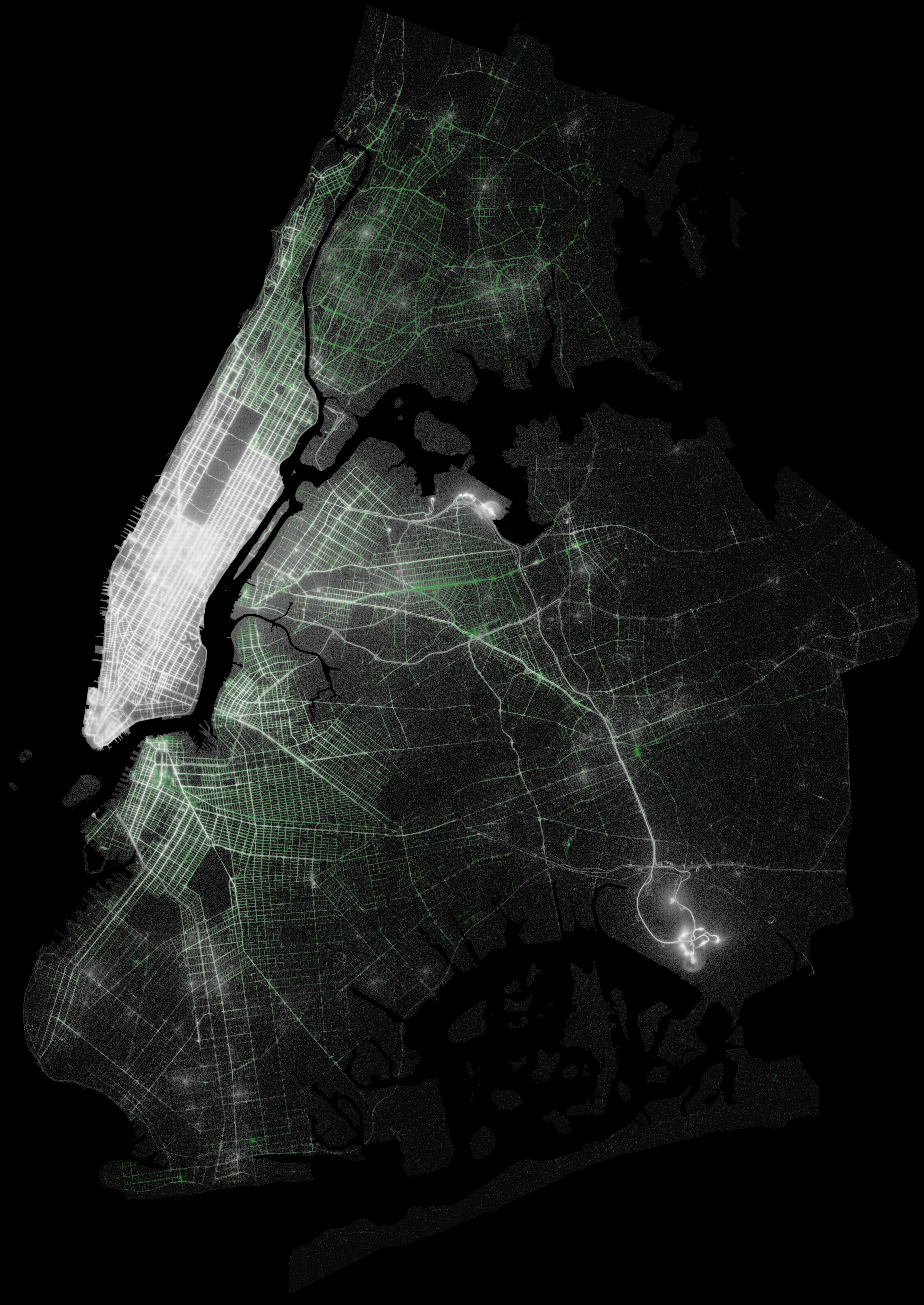